For the new thing, can collect them here. Please don’t expect things to change just because you post something.
Post Separator “Divider 2 (line)” the line should be more prominent (stronger stroke and/or across the entire post).
The day before yesterday at 6.50pm
Pet peeve of mine for the whole damn web. Could we have the date appear instead? Or at the very least, “two days ago”?
Also, I don’t see a “quote” feature, and the italics I did use do not look italicized at all, at least in the original posting box.
Also, I don’t see a “quote”
You have set the Mid Century Modern style, which uses Univers for body text, and that has horrific italics, so I changed it to a colour for emphasis. All the other ones have italics.
The quote feature is the button on the editor with a pair of inverted commas to the top left of a bunch of text, i.e. to the right of numbered list.
Maybe I’m just not seeing it but how do you get back to the list of threads underneath a board after clicking into a thread? I can see how to get back to Site New Answers and the home page, but what if I’m looking at a thread on ILE and I want to go back to the list of threads tagged to that board? Is that direct navigation path no longer there or am I blind?
Or is it just the back button on the browser?
Well that or the board link, Dan.
i.e. Keith’s Board on this one.
Thought it worth noting: email for log in is case sensitive. Most keyboards autocapatilise the first word in a box. Took me a while to figure out why I couldn’t log in
Ah right, thank you. I had not noticed. I will sort.
Well that or the board link, Dan.
Huh, I tried to click that and it didn’t seem to do anything. I’ll chalk that up to user error.
Someone else got to the case-sensitive email, which is a pain when you’re on a device that wants to capitalize everything
Are the board shortcuts in the settings working for other people? They don’t seem to work for me.
Got to say, despite being a change-hater my feelings are generally positive about most of the features over here—will have more considered feedback when I’ve got used to it, for now I’m just poking at things.
I guess the board shortcut thing is sort of similar to DJP’s issue? I thought I would solve it with the settings but it doesn’t seem to work.
I’m going back and forth between the browser and Zing and it seems like embedded threads take you out of Zing and into a browser window. I’ll do a little more fiddling to confirm.
Yeah. Only seeing this from a phone browser and have some real worries re: reactions and text size. But otherwise, cosign e.mily overall positive impression
Also missing who updated a thread in the landing page. More important than who posted imo, but please find a way to keep both!
I haven’t done much on phone browser stuff, because of Zing, so I would expect it will be a bit ropey at that size at the moment anyway.
Thanks, Emily... I can see a board shortcut in the menu okay. Happy to fix, but not sure what the issue is.
Actually let me be clearer about what I’m talking about; I don’t see a link back to the board when reading a thread on the browser. I see the icons across the top that can navigate me back to the board list or recent activity but I don’t see a direct link from here to Keith’s Board. If I click Bugs, Comments etc link, it reloads this thread.
Yes, it’s not in the menu, I mean above the thread title, e.g. “Bugs, Comments Etc.” in this case. What Emily’s talking about is that you can go in settings and pick boards you do want in the actual menu, and they’ll show left of Recent Activity.
(In Zing, the app’s back button is context sensitive, so it will go back to either Recent Activity or the thread’s parent board based on where I opened the thread from)
Oh do you mean in Zing?
Also, if you’re in a wide enough browser, there’s a breadcrumb trail on the left, but it does get removed if there’s not enough room on the screen.
That is what’s happening. On my iPhone, the board name is being removed from the display if the phone is in portrait orientation. In landscape orientation, I can see the board name.
So when I go into settings and click a board to add as a shortcut, it just zooms me up to the top of the page, then when I scroll down the box remains unticked and no shortcut added. Could be my old set-up again, but wanted to know if it was doing it to anyone else!
I am seeing ‘Keith’s Board’ etc at the top of threads (and am also on a laptop not phone), so not the same issue as DJP in fact.
That is weird, Emily—don’t know what it is at the moment and am off to Glasgow for a while so will take a look later. Sorry about that.
Dan, right, I get you now—it’s easily fixable, the context is I didn’t expect people to be using the website in a mobile browser—I expected them to be using Zing, so I did the kind of minimum to make it work there. I will sort it when back from Glasgow.
And Emily, yeah it’s supposed to have a little button on the menu for each board you have chosen to be on the menu.
Thanks Keith, no rush at all.
The quote feature is the button on the editor with a pair of inverted commas to the top left of a bunch of text, i.e. to the right of numbered list.
Gotcha.
I chose Default (Swiss) for Typography, which works on the main pages and user names, but not for the post text (or here in this editor), which is a serif. Maybe by design?

OH. It’s that guy. In the icon menu, I thought it was Reginald Van Gleason III trying to fight me.
Hmm.
Image hosters like imgbb.com or imgur don’t make it easy to grab the specific .png URL of an image. Not a complaint about the new pop-up window, but more of a “just sayin’.”
PJ Harvey
God bless the USA
The bolding of capital letters in Book font is, uh, interesting.
VERY interesting.
Reported you for this
Hmm ok replying doesn’t really do what I expected
Not what you EXPECTED or not what you EXPECTED?
(First one is just all-caps. Second one is all-caps with the bolding.)
Oh, the new posts bounce. Like a newspaper hitting the front porch.
If the new format really has 14,500 lines of code, I’d bet that we can get that under 13,500 by the end of the week!
Also not a fan of the auto-break that happens on long words at the end of lines.
First, huge thanks for all the work you’ve out into this.
One recommendation for a UI improvement: on mobile, can the username under posts be distinguished (e.g. different colour or font size) from the post text—I keep reading usernames as if it were part of the post. Thanks!
The day before yesterday at 6.50pm
Pet peeve of mine for the whole damn web. Could we have the date appear instead? Or at the very least, “two days ago”?
Also, I don’t see a “quote” feature, and the italics I did use do not look italicized at all, at least in the original posting box.
also a supporter of having a time/date appear instead
It can even be 6 August, 21:01, or however you write it in metric.
it’s probably like Aug 6 stone kilograms or something
i like the “work” mode in the settings! i honestly didn’t realize i’d selected it and was confused why everything was grayscale (my mac is dying and figured it might be related). but it’s a good option for those browse at work, seems like a good new feature thanks
The date thing. Sorry, I’m a bit confused. Are you saying you want it to display a local date, as in your time, wherever you are in the world as a date and time, rather than some English representation of a relative time?
I’m confused because you kind of mention both, and also I’d have thought the date time is by far and away the most common around the internet.
I’m sure I can do it, I just need to be sure what you’re looking for.
Are you saying you want it to display a local date, as in your time, wherever you are in the world as a date and time, rather than some English representation of a relative time?
Yes. It can even be GMT.
I can’t remember what the day before yesterday was, but “Tuesday” would spell everything out.
Okay. The I’ll add it to the list, although please bear with me as, as you might imagine, the list is growing.
I can’t find where someone mentioned it, but there were two issues with usernames and passwords, case sensitivity and Apple’s password manager not dealing with it well... I’ve sorted the former and tried to sort the latter, although that stuff is kind of voodoo (because their browsers guess at stuff), but you can let me know if it’s made a difference or not.
Also Dan, I put the board back on the mobile view.
Currently, the only way to determine if a post has been edited is to click on it, correct?
Yes, I thought it would be too intrusive to have some kind of notifier, given 99% of edits are likely to be just typos.
No “last updated by” or am I missing it
Someone else mentioned that, (7, 4) and I’m not sure what they mean... I think it’s showing basically the same info it used to, but I must be missing something. Whereabouts are you meaning?
I’m on mobile & this is what I see on the SNA equivalent:
Recently updated threads |
|---|
KB  Started yesterday at 2:22 pm by Keith 58 posts. |
ILE Started the day before yesterday at 1:56 pm by pfunkboy of the Sandbox 41 posts, two new since you last read. |
ILM  Started yesterday at 1:15 pm by peas, ma’am (rusty flathead screwdriver) 2 posts. |
So it’s showing started by (poster) at (time) but not updated by (poster) at (time)
Ah on mobile... Right yes, that makes sense, it does hide a bunch of stuff, but basically so there’s enough space. Again, that’s not a trivial fix, because it’s basically removing the second column from the table that’s shown on a larger browser, so afraid I can’t sort that in short order. I will consider it along with the other suggestions that are in the same space. They are ordered by most recently updated though.
Worth reiterating, I assumed people on mobile would be using Zing, so haven’t done loads of tweaking there...
The ‘unfollow’ button should now not be showing for non-admin. It wouldn’t have worked anyway if you’re not an admin, but the button shouldn’t have been there.
[img] [Link]
Larry, you want to insert them either with the little paperclip icon in the menu, or just post the URLs... Don’t bother with the BBcode stuff.
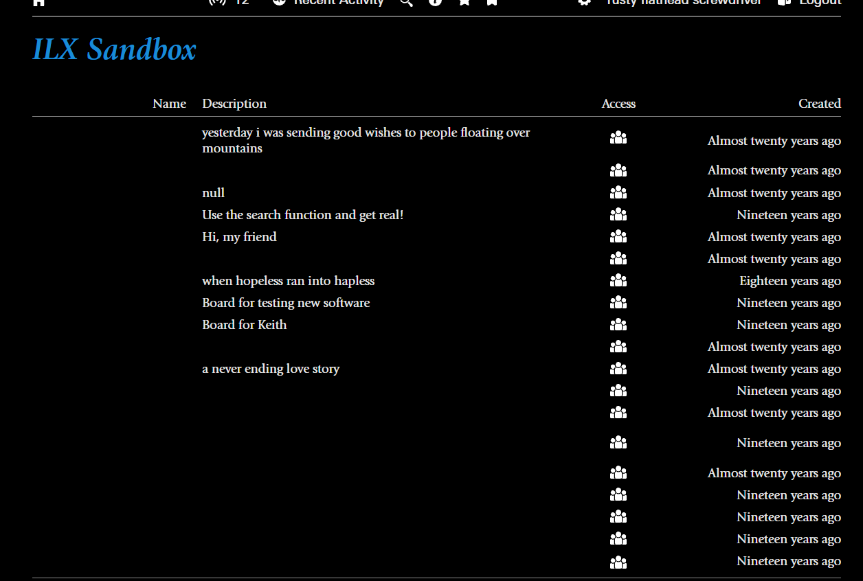
Small thing here, but I just noticed that, in Dark Mode, the Giovanni Typeface doesn’t display the board names on the home page.
Also Dan, I put the board back on the mobile view.I noticed, thanks!
Right you are. I suspect it was all things in dark mode, so hopefully works now.
TBH dark mode was quite late-breaking and is quite hard, mainly because there are so many bits of the site, I forget what they all are in order to check them all, so feel free to let me know if you see any other issues.
And you caught another one there to do with editing posts with replies in them. Cheers.
Just popping in to say that the board selection settings seem to work for me today, so now I have the most important boards up top, excellente.
One question: is there a ‘my recent posts’ function like there is on the current site? Couldn’t quite remember if I’d posted about board selection in this thread or another one and would’ve been handy to locate it faster that way. Honestly not actually that bothered if there isn’t one and can’t be one, but wondering if there is and I just missed it...
Yes, on the search page.
Awesome, thank you!
This looks so much better on mobile browser with the username below the post, than on desktop browser with the username to the left of the post.
No bother! Glad the other thing works too.
I kind of cringe even making this suggestion, but would you consider making the black background in dark mode more of a dark grey? The high contrast isn’t as chill on my eyes as dark modes that are less contrasty. This is why I’d some kind of love color themes, but if that’s even possible maybe it’s something to play with down the road...
Yeah, I think that’s fine. Just bear with me, might take a bit of time, as Dark Mode is a massive pain in the arse to get right. I’d love to believe it’s me just changing one variable, and it probably should be, but it probably isn’t!
The front page is only spottily updating, which is to say I have looked at (and updated, and unbookmarked and re-bookmarked) the “The Future of ILx” thread and the recent activity insists there is a new post since my last visit.
Yeah it’s gone now of course.
That is odd... Have to go right now, but I’ll keep an eye out.
Hmm yeah that happened again with this one after you updated it, I bookmarked but it still showed up.
Again disappeared when I posted.
Is it because you didn’t click on the “you’ve read up to here”? I think you need to do that if you don’t make a new post.
Nope, clicked on that and the bookmark button. Didn’t even go away when I emojied up your message.
Re: poll results visualisations. I’ve set mine to bar chart as that’s the simplest graphic imo, but it still seems really big to me—is there any way to make the display size smaller? I suspect a lot of people won’t like the graphics at all, so maybe even have a “just text” option for those users? I like it but just want it to be a bit more minimal/take up less screen space.
Noticed that clicking on “Next Page” of a long thread (such as this one) takes me to the first post of the next page. That makes sense.
But clicking on “Previous Page” takes me to the final post of the previous page. In a continuous way, I get that — it’s the most recent post before the page I was just on. However, it should go to the top of the previous page.
If I’m reading a book and the author mentions something that happened on previous page, I’m not going to go back to to that page and start scanning from the bottom up.
On this thread, the disable chat button is messing with the layout of the board and thread title:

Here is a list of musicians. I want you to rank them in order of “I still dig this person” but leave at least one out.
I don’t know if you can see it, Keith, but it’s reproducible by starting a poll thread
Can I post a screenshot? Let’s see…
Let’s see if that works
xpost with current ilx, but i made this suggestion regarding navigating thread pages and stet asked me to post it here:
and also, a quick suggestion—if there isn’t already one, a keyboard shortcut to load the next/previous page of results would be helpful. would love to be on the keyboard more than the mouse
The thing I was experiencing with the persistent notification has stopped BTW.
Oh, no it hasn’t!
Nah, I get it too, Tim. Sometimes clicking you’ve read up to here and sometimes it doesn’t.
Just writing to post that I’m trying it out on mobile now, and it is smooth like butter.
I had a bunch of likes and concerns that I posted in the running thread on the main site, but it’s pretty deeply buried in the discussion on that thread, so I’m just going to repost it here, where they will be more relevant. Nothing major or impassioned, regarding the suggestions, either. I really appreciate the work that you’ve put into this Keith, and overall I’ve been really excited since PFunkboy announced this.
peace, man at 7:27 6 Aug 26
I’m putting my feedback in list form. This is not comprehensive—just a few things that have jumped out for me over the past day. Might come back with more, in time.
Likes
New poll fun
Watch Party feature
Mute/Unmute User (Ooo! Who should I mute first?)
Saved posts
Post editing
New formatting options (R.I.P. bbcode—you were a good code)
Suggestions
Recent Activity should be named Site New Answers
New Threads/Recent Activity would be easier to read on separate pages
Reactions—like most, not in favor. Seems out of character with the culture.
Report – the new “Reason” box would mark a huge change in the FP system. I’m not saying this is bad, but as a former mod, I’m just thinking about having to deal with it on the backend. Like, not only do you have the headache of looking at every meanspirited/offensive post that has been flagged, but then the users doing the flagging get a chance to offer a free-text explanation to the mods. It’s just that sometimes, the users who are doing the flagging are being assholes themselves. This could give them another avenue to express their assholery, but specifically towards the mods, who are already beleaguered. (Adding that this is probably an issue for the actual current mods to sort out, if they want to)
Favicon looks very similar to the Home Depot favicon, so if I’m browsing ilx while comparing prices on bandsaws, I might get confused. :)
Re: poll results visualisations. I’ve set mine to bar chart as that’s the simplest graphic imo, but it still seems really big to me—is there any way to make the display size smaller? I suspect a lot of people won’t like the graphics at all, so maybe even have a “just text” option for those users? I like it but just want it to be a bit more minimal/take up less screen space.
Happy to consider a ‘just text’ option if people want that.
Thank you very much for your considered views.
Site new answers: I know people are now used to it, but I do remember when a list of people called me a **** for calling it that back then! I think recent activity is more obvious to someone who isn’t used to it—answers on its own is an odd vestige of the original Greenspun design—most threads are not questions and answers... HOWEVER, that’s just my view, the more practical thing is just room on the menu... I have done loads of work just trying to neatly fit the stuff on that top menu without it spilling over on to the next line, which is both ugly and takes up too much room on mobile devices
Quite a few people have mentioned the new threads thing, so I will add that to the list
Reactions have clearly generated a strong ‘reaction’ from some. Some criticisms I think are fair and some seem like catastrophising, but I have heard the points
Providing a reason is a legal requirement, so I’m afraid it’s not really a question of whether we like it or not
I’m afraid I don’t even know who Home Depot are. I didn’t copy it!

For Flickr photos, you just post the URL of the Flickr page. Yes that’s not ideal, Dan. I’ll sort it.
Okay, hopefully sorted.
It’s definitely nothing to do with “You’ve read up to here”. On a thread you’ve bookmarked, clicking update or remove will make it go away, unless something is broken, although I can’t see any issues with it at the moment...
I will keep my eyes open.
FYI clicking read up to here (or the similar bookmark message) just makes it disappear from the screen, nothing more, nothing less. Just because it might be getting in the way of an image you’ve expanded.
Noticed that clicking on “Next Page” of a long thread (such as this one) takes me to the first post of the next page. That makes sense.
But clicking on “Previous Page” takes me to the final post of the previous page. In a continuous way, I get that — it’s the most recent post before the page I was just on. However, it should go to the top of the previous page.
If I’m reading a book and the author…
Not sure I agree with this, PP. You never read a book backwards, but you might read a thread backwards, although it’s probably unlikely . It seems to me if you are going backwards, and you’re reading e.g. message 101, then the next message you want to read is message 100, not message 50.
That said, it’s an unusual use case—if loads of people agree with you then fine, I’ll change it.