When will this be launched on ilx?
I’ve been looking at the settings https://sandbox.ilxor.com/settings and lots of good things there


Keith what are the differences?
There are many, and I can never remember them. I’ll try and post some as I remember what they are:
Rich text editor, rather than BBCode
You can edit your posts for five minutes after posting
A lot of typography stuff to make things look nice
The fact that it is alive, i.e. if someone else posts on a thread you have bookmarked, you’re notified about it immediately, or the post just shows on your screen, if you’re looking at that bit, at that time
There’s a lot of stuff in polls:
You can make a poll where the users have to rank options, rather than just pick one
These are then scored with two different methodologies (Dowdall; Condorcet)
If things work, key insights should be picked out of the results (e.g. broadly popular; niche picks; unpopular; you didn’t vote for at all, but other people like etc.)
How in agreement the voters were or otherwise, with a chart
The ability to start a poll but not immediately allow voting—gives some time for people to suggest options and for the options to be updated in this initial phase
Amongst other stuff.
Thanks Keith. I think once people realise there’s new stuff to improve ilx most will like it. It’s going to take a while for everyone to get used to it.
What are the differences between the modes?
That’s really what the explanation on the page is for.
Another suggestion (thanks for your patience Keith!): an option to hide “New Threads” so that “Recently updated threads” is full-width. (Unless that option already exists and I’m missing it?)
crüt, I found a way to achieve that by accident — I have the text size set really large on most websites so I can read without my glasses, even sitting back with my feet up on my desk. If “Recent Activity” is set large enough, Recently Updated Threads becomes full-width and New Threads gets bumped down lower on the page. Bump your text size up until New Threads disappears.
Thanks WmC! Making the browser window smaller does the trick too. Nice mobile responsive design!
Glad it works for you.
I do want to take in feedback, but over the course of months (under the assumption it’s polite and constructive—I will be ignoring/doubling down on the rest). People tend to have knee-jerk reactions to change. The new threads thing serves a purpose, and there is no other way to see new threads. Options can be useful too, but they need to be sparing, or the settings page becomes unusable/too complicated, so there needs to be judgement here, and that can come in time. Right now, only a few people have even seen this, so now is not the time to be making a whole load of changes.
Best to ignore rude, entitled or abusive posters
testing from Floorp
Honestly, I just think it looks really busy— the two columns is a ton of visual information, and one of the things that I like about ILX is how simple it is. What will happen with bookmarks?
Lots of great work here—excellent job Keith! Obvs highly subjective but poster details to the left of every post feels a bit off to me, in terms of the info hierarchy. Would like to have an option to move that metastuff elsewhere, eg to the bottom right of every post but it’s no big deal.
Automated em dashes feels like a gross violation though!
Thanks, Maggy. If you make the screen really small, it’ll put the poster on the bottom. I’m not saying that’s what you should do, but that it’s not tricky to do, but I do want it to look good and that takes some work.
This is a terrific prototype with lots of “oh, of course” changes.
The change in font changes the character somehow, but it is definitely easier to read (for me, an ageing long-sighted person).
I mostly like the new design—it’s not ponderous, it’s quite silly, the emphasis is on readability—I like that. I agree with tables that it looks too busy, especially the homepage, but I’m not enough of a designer to feedback on what to change about that.
Main thoughts:
I loved seeing a new comment pop up while I was writing this!
Comments aren’t quite differentiated enough when the username is on the left—i.e. the gap when one post ends and another post starts isn’t quite as clear as it is on old-ILX
I’m happy to go with emojis if That’s What The People Want, but I think it adds a certain gamification/dopamine-anxiety-provoking element that old-ILX did not. I mean, I’ve never while browsing ILX felt a faint anxiety that no one “liked” a post of mine. Emojis (IMO) add an element of internetty tension that I don’t necessarily like or want... but also, if you keep them that is totally fine, I’m not over-invested in that.
That said I don’t think I should be able to like my own posts!
Thank you for your thoughtful feedback... Re: comments, there are a bunch of options in settings:
How to divide posts up, including more space
A bunch of typographic themes
Make the ‘new answers’ page less busy
I love the “you’ve read up to here”
I like the idea of emojis in principle—quite often want to like a post without having to comment—but they feel a bit big in comparison to the text size?
After a little while of getting used to it and tweaking things I like this a lot. New poll formats are A+. The small caps are very classy. Well done Stet and Keith.
There is a lot of typography work, like ‘smart quotes’ and as you say SMALL CAPS, and as you noticed em dashes (it’s an AI world) amongst other things that try to take large chunks of text and properly turn them into paragraphs. Not so obvious on the sandbox, as it’s a lot of short posts, but you can post big chunks of Wikipedia in or something like that and whilst it’s not perfect, it does pretty well.
Neil Armstrong | |
|---|---|
 Armstrong in 1969 | |
Born | Neil Alden Armstrong August 5, 1930 |
Died | August 25, 2012 (aged 82) Fairfield, Ohio, U.S. |
Education | |
Spouses | Janet Shearon (m. 1956; div. 1994) Carol Knight (m. 1994) |
Children | 3 |
Awards | |
Space career | |
Rank | |
Time in space | 8d 14h 12m |
Selection | |
Total EVAs | 1 |
Total EVA time | 2h 31m |
Missions | |
Mission insignia |   |
Retirement | August 1971 |
Duration: 25 seconds.0:25 Armstrong’s “One small step” speech Recorded July 20, 1969 | |
Signature | |
 | |
Neil Alden Armstrong (August 5, 1930 – August 25, 2012) was an American astronaut and aeronautical engineer who, as the commander of the 1969 Apollo 11mission, became the first person to walk on the Moon. He was also a naval aviator, test pilot and university professor.
Armstrong was born and raised near Wapakoneta, Ohio. He entered Purdue University, studying aeronautical engineering, with the United States Navy paying his tuition under the Holloway Plan. He became a midshipman in 1949 and a naval aviator the following year. He saw action in the Korean War, flying the Grumman F9F Panther from the aircraft carrier USS Essex. After the war, he completed his bachelor’s degree at Purdue and became a test pilot at the National Advisory Committee for Aeronautics (NACA) High-Speed Flight Station at Edwards Air Force Base in California. He was the project pilot on Century Series fighters and flew the North American X-15 seven times. He was also a participant in the U.S. Air Force’s Man in Space Soonest and X-20 Dyna-Soar human spaceflight programs.
Armstrong joined the NASA Astronaut Corps in the second group, which was selected in 1962. He made his first spaceflight as command pilot of Gemini 8 in March 1966, becoming NASA’s first civilian astronaut to fly in space. During this mission with pilot David Scott, he performed the first docking of two spacecraft; the mission was aborted after Armstrong used some of his re-entry control fuel to stabilize a dangerous roll caused by a stuck thruster. During training for Armstrong’s second and last spaceflight as commander of Apollo 11, he had to eject from the Lunar Landing Research Vehicle moments before a crash.
On July 20, 1969, Armstrong and Apollo 11 Lunar Module (LM) pilot Buzz Aldrin became the first people to land on the Moon, and the next day they spent two and a half hours outside the Lunar Module Eagle spacecraft while Michael Collins remained in lunar orbit in the Apollo Command Module Columbia. When Armstrong first stepped onto the lunar surface, he famously said: “That’s one small step for [a] man, one giant leap for mankind.”[1][2][3][4] It was broadcast live to an estimated 530 million viewers worldwide. Apollo 11 was a major U.S. victory in the Space Race, by fulfilling a national goal proposed in 1961 by President John F. Kennedy “of landing a man on the Moon and returning him safely to the Earth” before the end of the decade. Along with Collins and Aldrin, Armstrong was awarded the Presidential Medal of Freedomby President Richard Nixon and received the 1969 Collier Trophy. President Jimmy Carter presented him with the Congressional Space Medal of Honor in 1978, he was inducted into the National Aviation Hall of Fame in 1979, and with his former crewmates received the Congressional Gold Medal in 2009.
Last post from me for now, but special shout out to the random thread card page—was genuinely ambushed by unexpected emosh reading posts from ILXors no longer with us.
but you can post big chunks of Wikipedia in or something like that and whilst it’s not perfect, it does pretty well.
But why would you do that? I always thought copy and pasting huge chunks of other websites into ILX threads was frowned upon.
At least it’s truncated in the Reply feature.
But you can’t see what I replied to without clicking on the “Replying” link.
Hello and all that, keep up the good work, etc. (Though at this point I do kinda agree I’m not sure about the reactions stuff. Beyond that, do whatever ya need to!)
Interviewer: Talk to me about the future of ILX.
The future of ILX gotta ~cuts tape~
I think it’s great. One minor thing I don’t agree with is turning caps into small caps cause it looks terrible with things like PJ Harvey.
I’m looking at it on a laptop and I’m used to new.css. About 50% of the width of the screen is now wasted compared to my usual view! Plus about a third of the height. It’s resulting in a LOT more scrolling for me to read the volume of text I normally would, and I think that’s what’s putting me off—instead of it being all lovely and open with text I can read at my leisure, it’s bunched up and I have to look at a corner of the screen and scroll.
I’m a weird person who feels physically a bit nauseous when I have to use a computer with a ‘wrong’ setup—I can’t yet work out if I can get used to this or not.
I like the thread icons for which board, unanswered, new threads, and polls. Is it feasible to add another icon that’s symbolizes a thread that I have already bookmarked?
Sure, although I think it should be an option to show that, just because believe it or not there are some people with c. 10,000 bookmarks!
I’m over 2500 bookmarks. Really my main problem isn’t with any version of ILX, it’s just that I haven’t yet learned how to let go of things. Every time Malcolm Gladwell, Amanda Palmer, etc. does something shitty I immediately go to ILX’s zing take on it.
I’m seeing the “(x) messages since you last bookmarked” red text so an icon may be unnecessary UI duplication.
Looking ahead to ILX 7.0 from here, how malleable is the UI? I’ve been on forums where you can not just change color and typography but where things are displayed on the page. Kinda like how Wikipedia does it, where you have five major display formats and then typography settings.
Lots of stuff to like here. If I am being fussy there’s something about the density of the content I am finding a little hard on my brain – an option for more white space between posts (at the expense of more scrolling) would be nice.
Will you allow users to submit custom CSS on the new version too?
Edit: noticed the cute animation when submitting a post – are you respecting users who have enabled the prefers reduced motion setting?
Aha, I have discovered the “Just more space” option for post separator.
Elvis, that does get pretty tricky... Not impossible, and I will give it some thought, but it’s just the sheer size/complexity of the UI.
Chews, glad you found the settings, there are a fair few of them. I liked your stylesheet BTW—you clearly put a bunch of effort into it, so sorry it couldn’t carry over, but I’m sure you can see why now. The bit where you did something to prevent a user changing it back made me laugh (was that deliberate? I had to delete the cookie!).
Re: custom CSS, in time, although it would realistically have to function as an override on the main stylesheet, given it’s currently 11,500 lines long.
Re: reduced motion: yes... Not impossible I have missed some, but it does turn off animations on e.g. the post menu.
A lot of feedback was puzzling me until I realized that a good chunk of what people were reacting to was only visible on a larger screen than a mobile browser. I very much prefer the stacked post + username view of my limited portrait viewport than the two column plus “you have read up to here” graphic of the landscape viewport.
Love your emojis, Dan!
Is there a way to move the poster’s name from the left of a post to the bottom of a post like existing ilx? (Viewing on a browser on a laptop primarily, some viewing on a browser on a phone.)
PBRK, there isn’t right now, and it’s a bit more of a structural change than just a style thing, but I will add it to the list. As Dan says, it does this on the phone (well, more specifically, if the width of the screen is < 550px, so you can shrink your browser 🤣), but on larger screen sizes if you just set that stuff, a bunch of other stuff winds up out of sync, so it’ll take longer as an option.
Do we have any way of telling what % of ILX traffic is via mobile web and apps rather than desktop?
Alba, actually no, I do differentiate between Zing and the rest, but a mobile browser just looks like a browser. It’s actually not that easy to do, because browsers don’t ‘tell’ the server they are a mobile-sized device, partly because advertisers were using all that stuff for browser fingerprinting.
Ah, that’s funny cause our analytics do where I work. So you do have the Zing % though?
Well not a percentage, but I can see who’s coming through that way at any given time (hardly anyone here yet; I did mention that Zing works with it, but people don’t seem to be using it yet).
There are ways of doing it, but you’re kind of guessing, which is what Dhugald analytics will be doing.
Sorry Google Analytics. Dhugald was the guy who did it for us.
I have google analytics running on ILX, I can give you access Alba if you want to write us a report!
I do however, know which DIVIDER people are using:
Value | Users | Percentage |
|---|---|---|
None (default) | 89 | 65.4% |
Divider 1 | 4 | 2.9% |
Divider 2 | 27 | 19.9% |
Divider 3 | 1 | 0.7% |
Divider 5 | 1 | 0.7% |
Divider 6 | 2 | 1.5% |
Divider 9 | 1 | 0.7% |
Divider 12 | 1 | 0.7% |
Divider 13 | 2 | 1.5% |
Divider 14 | 1 | 0.7% |
Divider 15 | 5 | 3.7% |
More space | 2 | 1.5% |
The feature I’m trying out at the moment is HiddenText entered here will be hidden to the user until they click on it.. Let’s also try out the Insert Media Summary feature.

I really like having recently updated threads and new threads in separate columns on the front page. Would prefer “recently updated threads” to read “site new answers” for the sake of tradition, but not the biggest deal.
Oh and I edited the typo in that post (at least the one I noticed, heh) and it felt like undreamt-of luxury.
I hate notifications. I hate them in video games and in forums. I hate them because they trigger a compulsion in me to deal with them like work tasks. I don’t want my leisure time to feel like work. I can deal with them as a necessary evil of life if they work. What I’m seeing in the sandbox is that despite clicking the notification and going to the thread that has been updated, the infuriating red “1” is still up there at the top of my screen. Mocking me.
You click the update button to get rid of it. If you mean you don’t want them to pop up while you’re just sitting them doing nothing (i.e. not refreshing the page), I understand that and have it on the list for a setting to let people disconnect.
Ah, I see. So, I need to perform an action to make it go away. I guess I can get used to that. Thanks!
No bother. TBH it’s a bit damned if you do damned if you don’t. I think either way would be possibly not what any given poster wants.
If you post, it gets rid of it automatically (as it’s assuming you have read up to the last post) and if you stick an (evil) reaction on it, similarly.
Unrelated, I’ve found myself wishing for a way to quickly jump to the top of a thread—especially for, like, poll threads. I haven’t turned on keyboard shortcuts yet, but maybe one of those does that?
Oh, I was also wondering.. I noticed that certain markdown things work in the text box, like underscores for italics, asterisk for bullet points, etc. Is that something that will work in Zing?
Keyboard settings like that are tricky, because of course they can only work when you’re not focused on an editor (or you couldn’t type that letter!), but I do think the same thing that it’d be good to find a nice way to easily go back to the top or bottom for that matter, I just haven’t thought of a good UX way to do that yet... I will keep trying.
Re: Zing, I don’t know, although it’s certainly not the same text editor, this being a website and that being an app, so not sure about that TBH. It’s one for stet.
...I just haven’t thought of a good UX way to do that yet...
Initially, I thought clicking the thread name in the upper left, under the board name, might take me to the top of the thread, but it only refreshes the thread where I am, which doesn’t seem all that useful to me. I think that could be a decent experience, but if not, maybe a “(top)” link next to it or something? (I don’t know jack about creating UI on a technical level.)
but it only refreshes the thread where I am, which doesn’t seem all that useful to me.
Yes, it does have another purpose though, where if you’ve gone direct to a message via a bookmark and want to just go to the thread.
I wouldn’t worry about knowing how to create it. I have tried to think of a neat way, that also needs to be non-obtrusive in the past (it’s really easy to solve one problem; the issues is when you try to solve ten of them by putting buttons in for them all, the UI becomes overwhelmed really quickly). But have a think too. I’m sure we can sort it somehow with a bit of thought.
Checking to see if the “italics” with this Mid-Century font looks anything like a hyperlink.
(And oh, I can’t just post a shorthand “www.ilxor.com” link and let the browser figure out if it’s http or https?)
Only reason I’m using Mid-Century is that it appears to be the only non-serif font available.
It looks like the url structure is different here — I sure hope existing links to threads and posts will continue to work post-migration!
Everything seems disproportionately to the right of my screen (desktop browser)—is this what everyone else is seeing too? The actual text of a thread (that isn’t headings, usernames etc) is probably about 50% of the width of my screen.
At the least, could the thread title be a lot smaller?
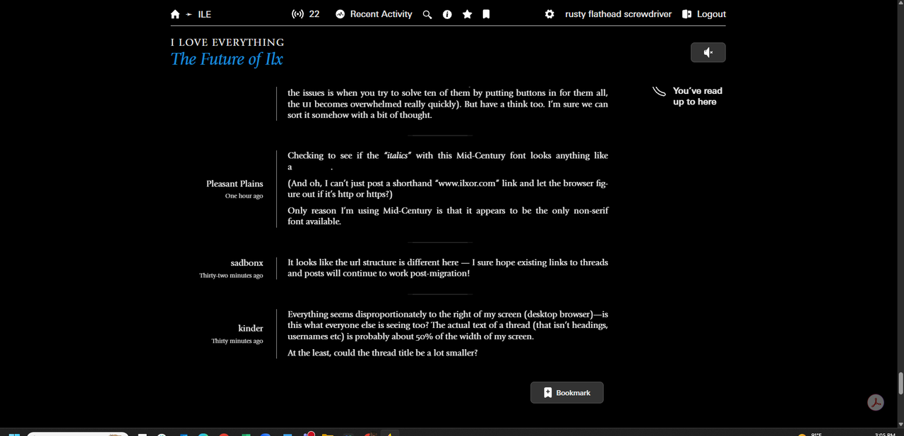
Kinder, here’s how it presents on my screen.
I personally would prefer if the username was positioned under the post and the actual post were taking up 75% of the screen width rather than just 50%
Or whatever the actual percentages are...
I’m digging the narrower column of text, myself. Less eyestrain/fatigue in a narrower column (ymmv of course).
I’ve not looked at the underlying code but as someone does web dev for a living I’m fairly certain that it should be easy enough to have another css theme to suit either preference
I just looked at the CSS and it’s a little daunting, as someone who has done web dev but never for a living.
It looks like each post is a div of class ‘message’ using grid-template-column to build a ‘metadata’ column and a ‘body’ column. I’ve not worked in grid in a good while—so not confident on the exact code needed but it should be possible to modify the display of that to some extent.
I’ve been able to change the front page to hide the right-hand column and push the width of the ‘recently updated threads’ column to fill the space vacated by ‘new threads’ (as would be my personal preference)
One thing I don’t understand, visually, is why, on Zing, when people make multiple posts in a row, there’s a line down the left of the posts, which only serves to make them look like they are one post.
Oh and also on Zing I do miss it remembering what you have put in the text box if you navigate away to check another thread or whatever. It’s too easy to accidentally lose unsaved progress. Maybe if it’s tricky to retain it just give a warning when you tap the back button that you’ll lose your work unless you copy and paste it.
the site has gone full grayscale for me. have I inadvertently checked some odd setting?
figured it out. work mode was enabled
Yeah, I was thinking about asking about this, too. Kind of a save draft function. I’m on another forum where it will save that per thread, so you don’t accidentally post something meant for another thread, which used to happen in Zing if you lost track of where you were, or didn’t clear it out first.
One thing I don’t understand, visually, is why, on Zing, when people make multiple posts in a row, there’s a line down the left of the posts, which only serves to make them look like they are one post.
This all started when I was working on accommodating the new embeds. It looked terrible whatever I did with the old row striping, so that had to go, but without the striping it was really hard to distinguish posts. So I tried the avatars and they actually struck me as way better than I feared. but one on each line of a multi-post run was awful. So then I coalesced posts and only had them on the first of a run which was better but some of the following posts looked a bit lost. So I added the rule.
I actually don’t think it quite works, but it was good enough to ship and start thinking about something better for next time. Very open to suggestions!
Oh and also on Zing I do miss it remembering what you have put in the text box if you navigate away to check another thread or whatever. It’s too easy to accidentally lose unsaved progress.
agreed—I was talking to keith about saving drafts and having them on the server and all that but it was becoming a bit much so it’s also on the list to revisit at some point.
Why is there sometimes an “Update” button and a “Remove” button at the bottom of a thread, neither of which seem to do anything when clicked?
They relate to bookmarks
As in, update saves your place for next time you open the thread.
Aha, thanks! I didn’t remember having bookmarked anything but I suppose I did, while I was clicking everything I could.
What if the happy icons increased proportionally in size for every click they got. Then it would be easy at a passing glance to see which comments were the most noteworthy.

It looks like the url structure is different here — I sure hope existing links to threads and posts will continue to work post-migration!
Existing URLs will work—the old URLs are translated and forwarded to the new ones.
I have it on the list to look at the type of view you’re talking about. I think I have mentioned this on the bugs thread.
The not-taking-up-the-whole-screen is elements of typographic style and the readablity guidelines around how wide a piece of text should be before people generally find it harder to read. It differs per font, because the metrics differ per font, but somewhere between 66–80 characters.
n/m
Just post the URL bit, or use the paperclip to insert image...
I personally hate reading current ilx on a widescreen. I usually make the window really narrow and increase the font size.
The free image hosting services usually only offer the HTML or BB versions of code with the URL embedded inside of it.
To post an image here, I’m having to paste the code, grab the image URL only, delete the rest of the code, open a window, choose an option, and then past the image URL.
And before, if I wanted to post multiple images at once, I could easily do so without going through a six-step process for each one.
if I wanted to post multiple images at once
Which maybe, I can see why you all did this. :-P
Okay, maybe I can make the BBCode thing work for them too then.
This list is getting bigger though, so bear with me.
stet pointed out in the mainsite thread that it’s possible to achieve this via the ‘import markdown’ option (just using markdown instead of bbcode) but it would be helpful if the markdown support was more clearly communicated in some way
in my view it’s not really important whether it’s markdown or bbcode, just that it’s very important that there is at least some sort of non-rich text option (which there is, it’s just maybe a bit too obscured as-is)


Huh. Ok. Check that one off the list.
Hardly anyone wants reactions.
Again, hardly anyone wants them, and they will absolutely ruin this website for many people.
Please either get rid of them entirely or have an option to hide them.
That they’re hideous should be enough. That a majority of ilxors don’t want them is even more important.
That there seems to be a refusal to address this issue makes me think that they’re going to stay. Please speak on this.
Agreed with Tabes, but I don’t think hiding them will do the trick as there is still bound to be discourse around their use—would really prefer that feature be removed entirely, if at all possible.
Kill reacts
That there seems to be a refusal to address this issue makes me think that they’re going to stay.
I am doing what I said I would do, listen to people, who express things politely and constructively, over a period of time, form a view and then move forward on it. This will take time.
What helps is to understand yours, and others views in a measured fashion. You have been on this place for a long time, and I would love to hear your views, especially as this is an issue you feel strongly enough about what you think the issues are and why you feel they will manifest themselves.
But, actually I feel far more importantly is the root cause of the feeling. Multiple people have made statements about how it’s against what ILX ‘is’ (paraphrasing somewhat), so what I’d like to understand is people’s views are on:
What ILX is... What does it represent? What is it not? What should it not be like? For example, is it a music discussion forum? Is it a general discussion forum? How does it differ from other forums, as in, what makes it different?
What should it be? I would expect that what people would like it to be is most likely different to what it is, in some way or another
The reason I ask is that I pick up from your points that you feel ILX is a certain thing that you like, and you feel that reactions would cheapen that in some way. This is not to avoid a question about reactions, but to understand what you and the others who don’t like them are coming from.
I know that you will struggle to believe this, but what you have hinted at ILX is or ought to be, is in as far as I can gather, much in line with my own views.
So in line with other points made on the comments page, I have no issue whatsoever in providing an option to hide them. This is reasonable, and it’s easily defensible, in that it doesn’t make the choice for anyone other than the user.
That sounds like reactions are here to stay, though perhaps hidden at the discretion of individual posters, as long as there is any support whatsoever, which would be extremely disappointing given the apparent landslide against them.
Nice tweak! Thanks.
Yeah I don’t know WTF I was thinking with the cloud thing anyway. Head in the cloud.
Daniel Rf OTM about why reactions would change how ILX discussions work, great post.
it’s not clearly a music message board for any particular sort of music either which makes it a bit of a harder sell too. it has its leanings and those are unfortunately a bit narrower than they used to be as a lot of people have moved on.
Nor should it be. It’s a music messageboard for all music. (Im not saying you think it should be)
One thing that most online forums don’t have in comparison to in-person conversation is you don’t get to see how the listeners are reacting to things—you don’t see the nods of agreement/the chuckles/the furrowed brows of confusion.

I do not have strong feelings about many of these changes. However, I do think that the ‘replying to’ feature creates a funny kind of multithreaded discussion that I don’t enjoy very much.
Although I privately seethe a lot about writing something I think adds to a discussion and feeling like my post is ignored in the scrum of two strident weirdos taking chunks out of each other in a personal BOEUF, I also like the simple linear reading experience, top to bottom, of ILX discourse.
Remy, I do tend to agree, although a lot of people have wanted over the last 20 years. I tried to make it quite inobtrusive and certainly avoid any kind of threaded discussion-type thing.
How do you set a bookmark that’s not at the most recent post in a thread?
I didn’t do @reply-type things, although someone asked for them upthread or on the other one. That was because that fundamentally works by notifying you, and (a) people might not want to be and (b) that would lead to some really complicated system of OKing and not OKing reply notifications from people.
Dr C, you can’t, but it’s been replaced by another function, which is the Save thing in the menu... Those go into the saved posts (star thingy) in the main menu, so they operate independently of bookmarks.
Hmm. Is that baked deep into the code? Like, for example, could “Update bookmark at this post” be added to the options that come up when you click on a post?
I ask because, while I get the value of having the save-post option for its own purposes, it sorta limits the power of bookmarks. In 2.0 I can use bookmarks both to keep up with a current thread that’s frequently updating, or a big long thread that I’m slowly reading through over multiple sittings. The latter functionality isn’t that well-served by “Save Post,” since saving posts every time I stop reading means I’m creating a bunch of bookmarks (effectively) for the same thread.
Is there an example of the “thread activity chart” that “will become available once two months of data is recorded” that you can share?
never mind, I forgot there are older threads on here
Lurkers represent !
Fwiw, Keith, answering some of your more existential questions:
I think that of course there is the rise of social media to blame for dwindling population and posting on ILX, but I think in addition to that, the level of interaction with digital interfaces and screens has increased so much since 2004, and that creates new issues. I think many potential new users are already overloaded by not just social media but everything else, and so adding one more thing— especially one that looks and feels different than most of the internet and doesn’t have the same priorities as the rest of the internet— can be extremely daunting.
That said, I want more new users. I would be overjoyed to talk with new people about NNCK (speak of necroposting, that recent thread bump alerted me to their upcoming show, for which I bought a ticket) or weird books or any number of other topics. This isn’t because I don’t like talking with the people here— far from it— but because new perspectives could be enriching to the community.
How to attract new members? I don’t totally know, though I have some ideas. One thing I will say is that given the exodus from social media, making the site look more like social media is clearly not the good choice if we’re trying to attract new people.
I can use bookmarks both to keep up with a current thread that’s frequently updating, or a big long thread that I’m slowly reading through over multiple sittings. The latter functionality isn’t that well-served by “Save Post,”
Yes I’m the same as Dr C. I don’t use bookmarks to save particular posts I use them to mark where I’m up to, and on busy threads I often haven’t got time or inclination to fully catch up in one sitting, so I’d really miss this feature.
Sure, just look at a Sandbox thread that’s older, e.g.

i don’t want it to be the case, but it kinda seems like it
in any case i always will/absolutely continue to love you all
especially harry
[Image]
Please don’t get excited about it, it’s not massively exciting!
I’ve been doing a lot of thinking about the reactions because my gut feeling when I first saw them was URGH NO PLEASE and I’m afraid that hasn’t changed. I’m going to explain this in a really badly muddled way so please bear with me.
I think what it boils down to is not how reactions are used by you and me and anyone with a social media account. It’s about how reactions are used by big tech.
They’re a way to get people to keep coming back to check how many likes they have, because the more you come back, the more other stuff (ads or whatever) you will see. They are a way of measuring a kind of blank engagement (lower in the hierarchy than comments, which require more effort, but a measurable nonetheless) which enables them to collect more data about you and what you like, and sell you more stuff. They are a tool to make a product sticky (aka addictive) and they help create an environment that enables Big Social Media to do what Big Social Media exists to do, which is categorically not to give you somewhere to chat to your mates and have a nice time.
And so I think the gut feeling of URGH NO PLEASE is justified because I know the intentions behind reactions here are 100% good, but it still feels like adopting a nefarious tactic for our little corner of the internet, and more so if you’re going to send people a notification every time they get a reaction.
TLDR: ILX isn’t big and it doesn’t exist to sell people stuff, so reactions feel wrong here. It’s about perceptions, which do matter. To me.
Also I’m scarred by my father’s constant use of one single emoji in WhatsApp. I could win a gold medal at the Olympics, or give birth to quintuplets, and he’d still send me a big yellow thumb.
Dr C, Alba, was in the middle of replying and got dragged away. Yes it’s an interesting unintended consequence of bookmarks (WHAT IS THIS SHIT? WHAT ARE THEY EVEN FOR? TURN IT OFF—sorry, this is 20 years ago) that I hadn’t designed it for back then.
But I get it, and no there’s nothing particularly hard outside of UX in making that work... In fact, it’s basically easy. Can we see how others feel over a bit of time, please? I know that’s sounding a bit like no I’m not going to do it, but that’s not true, I’m fine with doing it, I just want to get a good feel for how others have used the same stuff in case there’s a good way of solving everyone’s needs there. This is actually the same as other stuff—part of my challenge is kind of collating and synthesising stuff into a coherent whole. A lot of that came from the Ideas for ILX, but the interesting thing about times like there is exactly what you guys are saying—you use it in a way I never thought people would.
I realise the only thing I’ve posted here so far has been about reactions but I do think the rest of the updates are pretty strong and in some cases genius!
Tabes, thanks for this... It’s going to require more time and thought from me though, and I have to go out now, but I will get back to you properly tomorrow. I certainly don’t know all the answers either, but it is a really good conversation to have.
I think that is the best most measured post on this than I’ve seen and I agree with you.
I wish everyone was as polite and constructive. Including myself.
p.s. re the previous point about bookmarks, what I mean is that I will do it, I just want to see if others have needs to that helps inform how best to do it.
Keith, you gave me a thumbs up on purpose, didn’t you? runs out the front door triggeredly
Haha!
Of course that’s okay! I floated it in the spirit of a suggested tweak, just one of those little things around the edges.
I genuinely found it interesting. I do find it continually weird how some people have come to love something I didn’t design and didn’t think through!
(That’s not quite right, to be fair. Loads of thinking went into making the thing actually run properly, and not crash the instant it was hit by loads of traffic, which as you’ll remember, it was back then)
The problem these days, is that the heavy traffic comes from AI scraping bots, not actual people. FFS.
Oh actually what does the sub board mod side of this look like? (Not gonna ask about site mod, do not want to go back down that route)
It looks AMAZING.
Is there a way to block ai scrapers from accessing the site? That’s kind of gross, worse than ad scrapers even.
Also, great job! V impressive.
So is the only way to get poster names below their posts to make my browser window super tiny?
That, or browse on a phone
Yah in phone browser they show up under posts (as is best and correct). The separator is still centered rather than left-aligned, but there’s also a little more white space so it’s not as needed. However, the top-of-the-screen stuff spills into two lines (maybe cause I selected too many boards to follow).
I’m not bothered by the board getting smaller and I’m not sure what could be done about it if growing the board was a goal. Besides the aggressive tone of early ILX, the amount of people made it harder for me to keep up and more intimidating. I’m fine with smaller parties, and ILX will have a life cycle like anything else. Doing anything contrary to our current path for the sake of attracting newbies is bogus.
I hope you don’t see this as confrontational, Keith, but instead of us having to justify why we don’t like a feature, I honestly feel the onus is/was on you to justify why add it to begin with? Anything that goes beyond simple QoL features (like the editor, etc) and deviates dramatically with the layout and feature set of the old site should require some justification and explanation to the community.
Building it out does feel a bit of a “arguing or proposing in bad faith” kinda tactic, whether or not that was the intent!
But rather than us having to say with so many voices why something is bad, I think, to an even bigger extent, you need to justify why it’s good for ILX.
I also feel a bit of trust has been broken for some peeps, and it is indeed on you to help rebuild that!
Hey, I’ve not read this thread all the way through—will go back and do it—but is there an option to bookmark a thread part-way through, like you can bookmark any post on the existing site? I have loads of threads I’ve bookmarked part-way through on purpose (e.g. TV threads where I’m only a few episodes in). on Sandbox I can only seem to bookmark at the end of a thread.
Sorry if this is addressed already but, I can’t bookmark where I was at so....
my wishlist fwiw (20+ year poster)
no reacts (though opportunity for hijinx / trolling is tempting)
old.css look and feel (i.e. names under posts, full width posts)
ban louis jagger
engage with feedback on main board (ILX 2)
put mark C back in airplane mode
With the reduced width (still the no. 1 readability issue for me—sorry ) I’m noticing a lot of te-xt broken up by dash-es at the end of a line and now THAT’S annoying me too! I feel like the flow of long-form answers is totally wrecked and it’s just like “type into this corner of the screen”.
I don’t think I’ve registered my dislike of the reacts either yet, so here it is. If I could change one thing it’d be the small area of readable screen real estate, not the reacts. And I could live with a ‘lol’ and ‘otm’ react ONLY.
EDIT: And the 5-min edit function is a great addition—with the ability to view before/after edits. Will hopefully reduce ‘oops, typo’ posts.
Yeah ultimately if it looks and feels like old ILX, whatever backend changes are fine, but the look and feel of this place is important and shouldn’t just be changed.
And I don’t even use old.css! (I use new.css)
new.css users… they walk among us
if we have to have reacts, make them OTM, lol and RP (resultant paste)
I love new.css and wish everything was like it, tbh!
I have now scrolled through and seen that my bookmark comment has been addressed (but also would love to bookmark a post instead of save it...?!)
I think the ‘reply to’ function is great in theory but needs a couple of tweaks/ make it user policy to quote some of it, because I’m seeing people being replied to and agreed with but I can’t remember who said what or what is being agreed with. C&Ping to quote was a bit clunky but it did make you focus in on what specifically was said and what you’re responding to.
will I be able to report/FP a user’s reactions??
(And of course thank you Keith for the huge amount of work you have put into this)
OTM, lol, RP (resultant paste) and FP (flag paste)
I see reacts are gone! that’s awesome, thank you Keith, and appreciate the quick turnaround.
For updates on changes, are you just posting here? I wonder if making separate posts for each iteration of updates would help? You could share what you’ve worked on, what you’ve taken into account as stuff to do, and offer up things for us to test out too, and each being a separate thread helps reduce noise and confusion.
OH WHOOPS. My bad, my own browser plugin’s dark mode was hiding them. I take it all back
Testing what a horizontal line would look like
Looks like they don’t appear!
But yeah hope they can soon—I will absolutely pre/postfix all future posts here with them to enhance readability of at least my posts and those adjacent (until the layout us updated). It’s extremely hard to read and understand who wrote what without them
I turned on horizontal line as the ‘separator’ in the settings (gear icon), where Keith is offering a number of options (polled in another thread). It only shows up when posts shift from one poster to another, not between multiple posts by the same poster. You can also forcibly create one by starting a new line and typing three dashes. But overall I stand by my belief that posts need stronger horizontal separators, and there’s no reason not to keeping using the poster’s ‘signature.’ It’s on the screen already, it works as a separator, and it’s desirable anyway because it makes it a lot easier to keep track of who’s saying what.
kinder
With the reduced width (still the no. 1 readability issue for me—sorry ) I’m noticing a lot of te-xt broken up by dash-es at the end of a line and now THAT’S annoying me too! I feel like the flow of long-form answers is totally wrecked and it’s just like “type into this corner of the screen”.
I figured out why this annoys me too. Books don’t break words (usually), but newspapers do.
I don’t see any functional or even aesthetic reason to justify the lines into tidy blocks (except I guess because you can?), but boy, of all the things I’ve gone on about, this is low on the list.
I don’t see this in the mobile browser, interstingly
There is a screen width where the user name falls under the message (so small though). Which means there’s a screen size delimiter in the css for it. In which case it would be trivial to apply that look/feel at a wider screen width
Hi all, I think work mode is the mode for me—feels most like old ILX in terms of what I actively enjoyed about it—supremacy of text and discussion, minimal everything else.
So thank you for this option! If I were to make a humble suggestion it would be that the control bar at the top of the page be repeated at the bottom of the page, making returning to ILM or ILE one step quicker.
Also, I use the site in my phone browser (Safari) and the rich text bold button doesn’t seem to do anything, at least in the mode I am using. Underline and Italics work ok.
Treefell, are you the guy that lives in the old Luma factory building? I have a vague recollection of reading somewhere on the thing, or maybe I’m getting you mixed up with someone else.
I’ll reply properly tomorrow to a bunch of questions. Late at night tonight!
Awesome! Yes that’s a huge win already for readability. Nice, Keith.
Dark mode might need a good gander from people. If you reply it appears to not dark mode the reply text when typing

Can you make it auto-FP users who post imgur images?
You’re getting me mixed up with someone else. I’m Edinburgh based
Fwiw, Keith, answering some of your more existential questions:
I think that of course there is the rise of social media to blame for dwindling population and posting on ILX, but I think in addition to that, the level of interaction with digital interfaces and screens has increased so much since 2004, and that creates new issues. I think many potential new users are already overloaded by not just…
hey! i’m ‘new blood’ i think! i found this forum around 2024, forgot about it, and rediscovered it and made an account this year. i’m still more of a lurker but i have gotten a lot out of this site (not this one, you know, the main one). indeed i probably spend more time than i’d like to admit reading through old and new threads alike. i wonder if there are others around who, like me, are younger than the board itself?
Ah sorry... Right you are. That means we could probably meet in the pub tomorrow 🤣
I’d be happy to buy you a pint some time for all the hard work you’ve put in to ILX. Unfortunately this weekend isn’t great. Anyway I should really head to bed now
That’s kind of you to say, thank you. Another time. All the best.
I always thought the anti-poll crowd on ILX were cranks but all the new poll stuff makes me insane. I don’t come to ilx to look at data visulaizations about polls with <20 responses, which is what most ilx polls get these days unless Pavement is involved. Having to wade through every dumb poll on ilx being rerun because someone can’t keep the new tech in their pants is going to turn me into a terrorist.
It seems the basic flow here:
1. Massive change to the basic look/feel of ILX, like posters names, dates, and times of posts no longer appearing between each post.
Response seems overwhelmingly in favor of retaining the basic look/feel, with a couple of shrugs in favor.
Those making the changes request justification for denying the shruggers their new toys.
This seems completely backward from the way it should be.
By the way, apparently you can’t make a numbered list without ILX 3.0 taking charge and screwing up the indentation. Fucking hate this Microsoft Word ass site.
i agree that the rich-text editor automatically turning any paragraph starting with 1. into a numbered list is really frustrating
just made it to the sandbox, I haven’t read everything and I don’t have big thoughts on the essence of ILX but some first uh reactions
I am in the anti-reaction camp. At work/Slack they are fine when I have to acknowledge something but don’t have anything else to say. Here I don’t have to do anything ever and that is good. There are no threads with long chains of lol/otm that somehow need cleaning up. If someone wants to participate beyond lurking they should write some words and see what happens.
Like other posters I enjoy using the bookmark feature to mark my place in a long thread, e.g. when watching an old show and I want to follow the discussion in “real time”. Would be unhappy if that was dropped.
The data visualisation blobs really add nothing and nobody will ever use them.
The thread formatting changes are very jarring and don’t look like anything else I use (closest to idk comments on some Wordpress sites), but I don’t hate trying something new.
I deeply respect the work that keeps ILX alive, and support stet/Keith in pretty much any changes they need to do to ensure it’s maintainable without constant firefighting.
is there no warning if someone has posted ahead of you?
The recent activity page has:
(1) A list of recently updated threads
(2) A list of new threads
You can also click through to
(3) A list of random threads
Each of these three lists has a different layout and shows different per-thread information. Just a suggestion but imo it would be cleaner if these were all the same thing: by default I would see (1) but I can switch it to (2) or (3) if I like. A really nice experience would allow filtering/searching in the same view though I don’t know what that would be like for perf.
On polls, I think it’s really important (as far as any of these things are important) that it’s crystal clear to people when their responses are going to be public. That might seem trivial on a music poll but on a personal matter much less so.
I turned the little post separators on and I dig em but if one user posts two or more posts then these posts don’t get the little line between them and my brain feels they should
Thank you for reading this, the single most crucial piece of nu-ILX feedback, you won’t regret it
Oh and I am also, respectfully, anti-reactions
yes otm i don’t see a good reason to treat posts by the same user differently
Alba, yes agreed. Thanks for the feedback too, emsworth...
If you don’t mind, can we post on the bugs/comments thread as it’ll help me keep views in one place and stops me needing to post what I’m about to post in both places... I’ll lock this later.
I made a bunch of options, based on your feedback. This is a real first draft and it’s quite possible some of them won’t work; they might even break existing things, because it’s been done quickly, but I thought you’d like to have a look.
If you look at the bottom of the settings page, there’s an experimental settings section, which has:
Post metadata below post, i.e. similar to the mobile configuration, but for all sizes
Hide images and embeds—a few people asked for this
Place new threads below recent activity—on the board/recent activity pages
Wide view—for those that want a wide page
Disconnected mode—for those that don’t want live updates
I did try to make one to set the base font size, but it’s not going to be a quick thing that, as not all the font sizes are relative to the base size and they need to be for that.
See what you think.
It would probably be a good idea to keep actual bugs and small details in the other thread, but keep this one open for the more macro discussion of what our visions are of ILX? I think it’s pretty challenging to juggle those two in one thread.
Okay, sure.
I just mean the other place is where I’d like to track bugs/comments etc.
I can’t see the bugs thread. Could someone link to it?
Oh, I hadn’t thought to look on other boards. It’s the one on “Keith’s board”, yes?
Thanks for adding these settings. I’m playing with them now
Thanks for implementing wide mode as an option.
I also use bookmarks to follow along with tv or film threads where I don’t want to go to the newest post, I bookmark at the discussion prior to the latest episode / watching the film—and it would be good if I could still do that
Thanks for implementing wide mode. I’ve found it only makes posts wide if the ‘Post metadata below post’ option is also enabled.
Gotta admit after trying it out for a while I kinda like the poster name to the left of the post. Should add I’m on Scrolling Mode 2, Work Mode and using the line divider between posts.
Glad to hear I’m not alone in missing ability to bookmark specific messages. Also useful when finding an interesting part of an old thread you want to read through.
Dislike the notifications and notification counter in tab title (or whatever that’s called).
I also prefer the poster name to the left of the post.
ditto (otm? thumbs up?)
Thanks for implementing wide mode. I’ve found it only makes posts wide if the ‘Post metadata below post’ option is also enabled.
Thanks for saying this. I went wide and it only moved everything to the left, but that next step fixed it.
I only quoted your post above and not your name, snoball, because I couldn’t highlight it all. It even skipped over your name and went straight to corrs’ post. Again, dealing with extra fancy stuff that makes simple processes more difficult.
Why didn’t I just reply to the post? Because it hides the post I’m replying to and just says “Replying to snoball” — which could be a post you made an hour ago or nearly twenty-one years ago.
It is modal I believe. So it will include the text of the post if it’s more than eight posts ago but just show “replying to snoball” if it’s more recent than that, to avoid too much duplication.
Haha!
Ok, this one was from over 24 hours ago.
So it includes the text from some posts but not others. And you can’t just copy and paste the text and poster’s info.
Thanks for implementing wide mode. I’ve found it only makes posts wide if the ‘Post metadata below post’ option is also enabled.
No bother, and I did it way too quickly, so I’m not surprised there are things wrong with it. I’ll take a look. So hang on, are you the guy who lives in the old Luma factory? I’m probably gonna be wrong again here, but I asked someone else yesterday!
Yeah, I’m not sure what that’s about. That one should. A bug, I guess.
I will be doing the bookmark thing; in fact, I would’ve done it already as I looked at it this morning, but it turned out to be a bit more complicated than I initially thought, so it’ll take a bit longer.
Is there a way to block ai scrapers from accessing the site? That’s kind of gross, worse than ad scrapers even.
Hey N, well no way to block them in a sense, strap yourself in... They make themselves look like normal web requests, because if there were some clear marker it were an AI bot, people would just block them. What a lot of work here has been to do is to at least cope with that situation as best I can.
Traffic is placed in different buckets:
Anonymous traffic
Logged in users
The front page
People trying to log in
Also anonymous API requests (computer to computer messages)—these are just blocked
And within that there are two controls
How many concurrent requests you are allowed (i.e. requests at pretty well exactly the same time), and
How many requests in a thirty second period you are allowed
The numbers are unimportant and I don’t know what they’ll actually be yet; they’ll require tweaking, but:
Anonymous users (AI etc.) get a certain amount of computer, but it’s capped at a certain point (based on the two aforementioned criteria)
People trying to log in get certain amount of computer—quite small, as it doesn’t require much, but it’s ring-fenced from the anonymous user stuff so it’s not overwhelmed—it’s so real users are able to log in during an ‘attack’
The front page also gets it’s own allowance to make sure people can find the site, even if it’s ‘under attack’
Logged in users get unlimited access (i.e. the rest of the available compute)
So you can’t prevent this stuff happening, but if this works the way I intended, then it should mean that even under attack, logged in (and trying to log in / front page) users can still operate as if nothing is happening.
I have tested it at 5–10,000 transactions per second on my laptop, depending on the type of transaction. By way of comparison, the existing site managed 400 transactions per second when I last tested it, although that was years ago.
Thanks,
Lemmy.
Oh and if an AI thing tried to register as a user and do it that way, I haven’t done this yet, but it’s quite easy to deal with, because real users don’t throw thousands of requests per second at the machine, so I would just cap logged in users at something way above real users generate, but that would stop AI bots easily—basically at that point if they’re logged in, then you can identify them.
The live notifications of new posts makes me fantasize about a Keith is typing... sort of notification so you know who’s imminently about to post also.
Sorry, I draw the line about fantasizing about Keith.
Wide view seems to work! Thank you Keith