xpost with current ilx, but i made this suggestion regarding navigating thread pages and stet asked me to post it here:
and also, a quick suggestion—if there isn’t already one, a keyboard shortcut to load the next/previous page of results would be helpful. would love to be on the keyboard more than the mouse
Sure, although what results do you mean? Search results? Keyboard stuff can be tricky because you need to not be e.g. focussed on an editor and the operating system takes control of a lot of keys, so as long as there are keys available I don’t mind doing this, but please let me know what results you’re meaning...
Getting some rather slow page loads today, it seems to be hanging on “Waiting for use.typekit.com”
That sounds like Adobe fonts... It should give up and just go with shitty fonts, but I’ve found whilst that does happen once in a blue moon, it’s not very often.
On current ILX I can see the titles of ~30 recently updated threads at a time when viewing a board or Site New Answers. On here I can see 6 at a time, which makes it a bit harder to navigate.
I understand it may be a PITA, but in an ideal world it would be great to have a “hide” button for the New Threads column — not another option on the preferences page, but a hide/show toggle on the column itself.
Could we put adding reactions to a vote? Maybe by e-mail like the year-end polls?
I really understand a lot of the negative feedback around layout... I think at a minimum it might be a good idea to consider a layout flag that simplifies things significantly (no “you’re read up to here” arrow, simple text only UI similar to the old site, etc). Part of the reason I love the OG site is it’s quite “text only” (I have the images/embeds turned OFF to really hammer this home). Also can a text only poll visualizer option exist too to support this?
UI animations can be slick, but what I’ve seen so far isn’t exactly super “useful” over time when they aren’t “useful” they get more annoying.
I do like the live updating though! very nice, especially while typing.
And a question: if/when this is replacing the OG site, will it pull off the archival data? Can we use the new search to find things from the old site? And will the old site still coexist in some fashion or will it be fully deprecated?
Is there any appetite for running some polls on the old site to take temperature on where everyone stands with certain significant features like reactions, layout, etc?
Edit: testing editing! noice
Edit: 2nd edit.
I mean, it does say “Previous Page,” not “Previous Post”.
You and I probably pronounce the word “tomato” differently too.
Not sure I agree with this, PP. You never read a book backwards, but you might read a thread backwards, although it’s probably unlikely . It seems to me if you are going backwards, and you’re reading e.g. message 101, then the next message you want to read is message 100, not message 50.
Hmm. How did you get the “Pleasant Plains said:” tag on your quote of my post?
And ha, this might be counter to all of the “too much excitement” feedback you’ve recieved, but would there be a way for me to tag someone on a post, like @Keith, check this out!
do we have to now post feedback here to get any sort of response? there’s a lot of feedback in the mainsite ile thread (amongst all the arguing about the process) that it would be good to see some sort of response to
i’ll also reiterate my main point from there:
it would be very helpful if there could be a post (probably ideally in a new thread) going through all the changes & new features, explaining what the thinking behind them is, and broadly giving some idea of how feedback is intended to be incorporated? like there may be good reasons behind some of the more initially disagreeable decisions, or maybe not, but it’s much easier to provide useful feedback if we understand where you’re coming from
Whether “catastrophizing” or not, people don’t want the reactions. Period. If this pretty widely held consensus opinion gets ignored, then what’s the point of giving any feedback on anything else? Asking in all seriousness.
The site does look much better on mobile fwiw, except the reactions ;)
The good: typeography, dark mode, live updates, starring of comments, personal account management functioning properly, and wysiwyg editor (finally!). Genuine quality of life improvements. Love the editing functionality now that I’ve tried it out (and feel the 5 min window is “fine”—it’s similar to Reddit, you can edit a comment before it’s marked with a * for a few mins, i.e. ninja editing, but this still exposes the history)
The meh: the visual layout of a thread—not a big fan of the arrow demarcating where you’ve been caught up... that can be expressed MUCH more concisely and elegantly. Animations are not exactly “useful”, and feel superfluous and a bit annoying, almost like “hey I can do this in JS+CSS, cool!” rather than thinking “just because I can, should I?. At a min, at least allow them to be turned off. And yeah, the way posts are split make it hard to read. We need horizontal lines between posts.
The bad: threads are very inefficient with screen space. The margins and whitespace is genuinely not good when zooming out and it forces a certain view of a thread. Multi column layout of posts in boards is bad—it’s genuinely hard to read different post titles and determine what I actually want to dive into next. The new posts on the right is not useful as a default view. Yeah reactions/emojis are bad, and I think one of the things that no one’s really brought up yet is that they are cheesy, kiss of death here haha. I think it will genuinely stifle discussion and discourage certain people from posting.
Requests:
Tagging/@ing—maybe this is not popular but I’d appreciate this (and maybe it can be an ”opt in“ feature so you won’t be notified by default).
Have different filters/views of threads in a board, like tabs or something that show ”new“, ”last updated“, etc (i.e. how reddit categorizes things).
If there is to be ANY ”reaction“ feature it should focus on this board’s use of ”OTM“ or ”OTMFM/OTFM“. It’s literally the only real means of a ”reaction“ used here.
when typing, lock the wysiwig menu as you scroll, having to scroll to the top of the message to hit ”bold“ is annoying, yes I can use a key combo but still.
Suggestion for a ”General Rule“: Focus on the old board’s tenets of ”simplicity“, and ”focus on discourse“. Celebrate its cultural and design uniqueness and idiosyncrasies! Graphics, charts, animations, these are niche features, honestly—any feature not facilitating a great discussion or reading experience is honestly going to hurt the culture here, because that’s what everything flows around with the existing site. Its limits and ”oldness“ actually facilitate unique discourse. It should be celebrated! Make the defaults simple and closer to the old board. Make features ”opt in“ rather than ”opt out“. If enough existing users ”opt in“, only then consider flipping it on as a default experience. Defining some ILX ”tenets“ would be good, feels like the new site is just kind of a bunch of improv and experimentation for experimentation’s sake.
Any appetite in running polls on the old site for certain features? Does that give the lurkers too much of a say?
stet/Keith, if you are not reading this I’ll post in the new board too, as I have already for some of the things.
Edit: I posted this on the old site too, but copying here for extra visibility
a thought on polls, from another thread, gonna see how it looks if i just link to my post:

thought on polls: why have an end date? for the ones like this where you see the results before you vote, and where you can change your vote afterward. would rather just have it be open! should change over time. like, neil fucking young. i’m gonna do this today and in 20 years i’ll do it again (and the on the beach title track is still gonna be what i have to return to)
also side note but it’s interesting about what makes people (including me!) not like time fades away nearly so much as all the adjacent material!
nice, that worked well! easy way to quote a post from another thread imo.
but, on the topic of polls, i’m sure there will be a lot of ilm people who may have strong feelings about this, but i realized tonight that maybe there’s not any point in waiting for poll results. maybe they should should just up there, like they are now in the default polls, where as votes come in they just show up. and you can change your own vote. and in that case, why ever “close” the poll? the only reason to close a poll is to have a final result/big reveal, but nothing’s ever final maaaan and who cares about big reveals. potentially.
anyway, sorry if there’s already been discussion on this, it’s just interesting and it changes the way a poll feels imo—in a good way.
how can I bookmark a specific message in a thread? say there are 100 new posts, I read 50 and want to bookmark my progress? maybe im missing smth obv in that case sry
Bookmarks only bookmark the latest one now... I know this is different, but there is a way to do what you’re looking for, which is to save the post... If you click the menu and click “Save” it will store it in your saved posts, and you can see that list as the Star icon in the main menu.
Z, forgive me if I don’t get to every point here, but actually I had exactly the same thought a few weeks ago.
I had considered the idea of re-running them, as it could be interesting to see how a group of individuals’ views on something has changed over time, but this is quite a big engineering job.
I think there’s some drama in having a point at which the detail on the results arrives, but it would be entirely possible to leave it open for voting / changing votes.
but actually I had exactly the same thought a few weeks ago.
I had considered the idea of re-running them, as it could be interesting to see how a group of individuals’ views on something has changed over time, but this is quite a big engineering job.
Did you aye? lol
Octo, thank you for your comments. One thing I would say is that twenty years ago, I did design and develop the existing ILX and everyone hated it! There’s a thread here about it somewhere! It is interesting to see that despite not really changing, it is now held up as some kind of pinnacle of web design. I knew literally nothing about design back then and only a minimum of CSS, so it’s difficult for me personally (although I understand it, if you’re not me, and you didn’t go through that) to believe it actually is really amazing vs. people are just used to it.
Your general rules are great, and they actually are what I focus on, but I can only assume you might not think that—or at least, not in all cases. When it comes to aesthetics, everyone always has their view, and everyone thinks that everyone else agrees with their view. so that makes it tricky. Also, things take time to settle in—over time I will make changes, provide options and take on people’s comments. I am already doing so, although responding here is taking up most of my time at the moment. Some of that is pretty easy (already done some) and some will take longer.
The tagging thing is something I have considered, but generally backed away because of its likelihood to be overused and get annoying. It’s a significant feature, with a variety of challenges (persistent notifications; lookup of usernames etc. etc.) but if people in general want it, then I can take a look.
only a minimum of CSSThis is a feature IMO. I really appreciate a site where there are not a lot of different fonts, different font sizes, backgrounds, boxes, rounded corners, icons, columns, animations ... even if it’s not as pretty as a site that’s got lots of design, I find it much more readable!
Sure, and I’m glad you like it. My point is that it’s not that way because I designed it as some kind of feature—it’s because I didn’t know what I was doing!
beautiful DIY fruit
emil.y: Re: poll results visualisations. I’ve set mine to bar chart as that’s the simplest graphic imo, but it still seems…
Happy to consider a ‘just text’ option if people want that.
Yeah, that would be awesome, and I’m pretty sure it wouldn’t just be me—as I say, I quite like having the visualisations available, but they just take up too much room on my screen, so if the size can’t be changed I’d probably have ‘just text’ as my default and then occasionally change my settings to look at some fun graphics.
I seem to get every notification twice.

Yes, I did that to make sure you noticed.
ONLY JOKING. That is odd... Not sure why that’s happening. I will look into it.
Actually, did you just go back to a tab you hadn’t been on for a bit? Because arstetzka and I both did post twice, and it does keep the notifications there until you re-open the tab.
No, I was just hanging out on the one tab.
Were you on another window and then move back to it?
No. I was steadily reading that one post you can glimpse in the screenshot when all four notifications popped up. It seems to happen about half the time.
Hmm, strange. I wonder it was maybe a network thing, i.e. you briefly disconnected, and then reconnected, and all the notifications came at once.
Is this an intentional design feature? All the posts (and usernames) in this thread before my post about duplicate notifications are in a smaller font than the posts after it.

Absolutely not. Has your computer got a virus? 🤣. Seriously, I don’t know what is going on there.
one of the things i love most about ILX is its web 1.0 feel (newold.css for life!)
threads are just text on a screen, unchanging as if they’ve been there forever. especially so with ILX’s deep archive, reading people’s live reactions to an album that came out 20 years ago
i must beg for the ability to turn off all the live update and social stuff.. it might sound a bit weird but it kinda triggers my social anxiety.. i didn’t even like the “x people are logged in” stuff on old-ILX.
THAT SAID. i love that the site has personality and whimsy with a lot of the new features and iconography. that’s something truly missing with modern web/software design. also from a tech perspective, it’s awesome! ...it just doesn’t feel like ilx0r to me
As I get used to this site I’m finding the old one harder to read, and harder to even look at!
And I was just now taking another screenshot of the same font phenomenon (notice how emily’s post is so much smaller than the ones below it) when you posted your virus post and I got another duplicate notification.

Heading offline for the rest of the day! Thanks for looking.
Thank you, I made newold many years ago. You might want to try “Book” here, which isn’t dissimilar. And you don’t need to bed to turn the live update stuff off, I will provide an option to do that.
I can see it, I just don’t understand it. Much more likely to be a browser thing than anything else—I’ve never see it anywhere else.
• Having to click on the “replying to ILXposter” posts in the first place to see what is being replied to is... well, I won’t say it’s difficult, but it’s certainly an extra step, but having an extra tab automatically get opened for each one is a more involved process.
I’m getting to the point where I’m not clicking on the “replying” links because it’s not worth the extra effort. “Is it really that important?” I ask myself.
• When “# of posts since you last read” appears on a thread on the front page(s), do those numbers just stay there forever, ticking up the new posts?
Sometimes, I’ll click on a thread to see what’s happening, go “Nope!” in my mind and move on. I’ll consider more carefully which thread to click on from now on if doing so means that it will be branded in pink on my front page forever.
• And more out of curiosity, at one point does ILX style move from using words for numbers to actual numbers for the numbers? AP Style uses words for only zero to nine (maybe ten) while ILX seems to be using words for everything from ninety-nine and lower.
On the other hand, there’s a chance that having a link to the post replied to will be extremely helpful when catching up in long threads... especially when pagination means it’ll be more complicated to go upwards and / or find text inside the page you have open.
That is exactly one of the challenges with replying, Tim... You might be replying on a page that doesn’t have the editor on it. It’s not easy—there are a lot of edge cases.
I’m getting the double-notification thing too now—DJP’s last post on a thread I was looking at came through twice
Yes, I have just figured it... And man was that obscure. It happens when:
A notification arrives
The notification is drawn on the screen, but at that point it works out if it’s visible on the screen or not, because if it’s visible, you just see the post; if it’s not, you see the notification
BUT, if you also have a separator set, it inserts the separator, and then accidentally counts both of the insertions as a single post and notifies you of both of them
MESSY. Anyway, I think I have fixed it.
I can see how “a new version of the application has been installed” might be useful for the person building the site but for me, a mere user, it is not.
It’s not a long term thing, Lukas, it’s really there just because when I put a new one up in the short term, it’s going to download a new bundle and take longer. I know that’s not explained, but I wanted some way of making it clear that it wasn’t just because it was slow. I will be removing it.
Anyway, really got to run now...
I will say the new interface is fun. Live updates is probably controversial (haven’t read everything) but I like it.
Surprising to me that Recent Activity does not have live updating
I like it, but I think it can be turned off for users ?
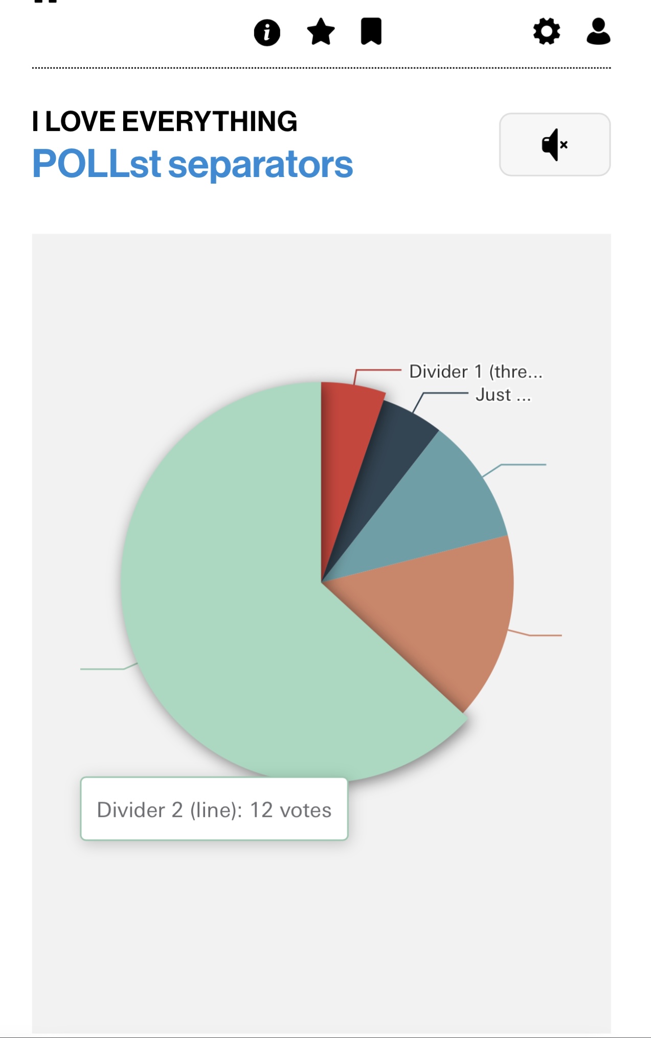
In mobile the pie chart polls are clipping the text off. minor, but thought i’d raise it.
Edit: Ugh I couldn’t work out how to make this image show inline. The one frustrating thing I’ve always disliked about ILX is it is the only site where you cant just copypaste an image in from your clipboard. I assume because no one’s willing to pay for localised image storage?
Yes, Keith and Stet did say that.
imgur is also blocked now in the UK so can’t really be used.
I don’t know which is the best to use for ease of use but I find https://imgbb.com/ very good and once you upload it and click on the image you can right click and select copy image address and you paste that using the function on here.
I expect there may be better sites that are easier to use and that someone can let us all know.
ok, you did use that site. See the paper clip icon at the end? use that to embed and as I said right click on the image and select copy image address.
i really like that you can search by “most recently updated” thread!
Trayce, thanks for even understanding that some kind of outlay is involved! And I hope all is good with you. But yeah the outlay is already enough for me... Storage is one cost, bandwidth the larger and more unpredictable one, as in, if all of a sudden some thread I dunno ‘goes viral’ then me and stet wind up paying a load of cash. Plus we would have to deal with what kind of stuff people are uploading—it needs management to stop people uploading the wrong kind of stuff. It’s really rather messy, but something we take very seriously.
Kate, thank you, in the sense that it’s really rare that people tell me stuff they like, rather than stuff they don’t like.
Kate, thank you, in the sense that it’s really rare that people tell me stuff they like, rather than stuff they don’t like.
yeah, it’s one of the most frustrating things about working on any project... it’s a litany of “i don’t like this, i don’t like this, i don’t like this”, which is, i mean, it’s an important part of testing—there are things right now that i find confusing or disorienting, and after using the sandbox for a little bit, if i haven’t figured them out i’ll mention them. this genuinely is cool and i genuinely do like it.
oh! i also like the revised thread URL format! it’s much more elegant and succinct.
Above the text editor box it says “Posting as: sadbonx (change this)”. If I click “change this” it goes to the settings page where it auto fills in my email address as my nickname. Screenshot redacted.

Hey I’ve always been mindful that this site costs someone money to host and run. And I honestly feel like some people don’t think of that. You are going out of your way and I thank you.
I did all of that as you outlined and it didnt work :( all good I must have done something amiss.
Thanks, Trayce—hope all is good with you.
I made a bunch of options, based on your feedback. This is a real first draft and it’s quite possible some of them won’t work; they might even break existing things, because it’s been done quickly, but I thought you’d like to have a look.
If you look at the bottom of the settings page, there’s an experimental settings section, which has:
Post metadata below post, i.e. similar to the mobile configuration, but for all sizes
Hide images and embeds—a few people asked for this
Place new threads below recent activity—on the board/recent activity pages
Wide view—for those that want a wide page
Disconnected mode—for those that don’t want live updates
I did try to make one to set the base font size, but it’s not going to be a quick thing that, as not all the font sizes are relative to the base size and they need to be for that.
See what you think.
Have to dash now... Hope nothing is broken too badly!
I’d like to say something positive about the reactions. I wasn’t in favour of them either, and indeed I was one of the first to say so, but I’ve just found a genuinely useful reason for having them.
I was able to acknowledge what Trayce said directly on her post rather than replying further down the thread and potentially breaking up the conversation. I feel it as a politeness thing.
I know it’s a very minor thing, but it’s a use I hadn’t considered. With further testing, we may discover other useful purposes for them, or we may not.
Either way, I think it’s worth trialling things like this on the Sandbox before Keith makes any permanent changes. That’s what the Sandbox is for, after all, and Keith has the far more important job of fixing bugs and getting everything working properly.
Wide View plus post metadata at the bottom of each post improves readability immensely. Thank you!
Now we just need Divider 2 (Line) to be across the width of the post.
more polite to acknowledge something with actual language
If we put reactions to a vote, “no reactions” would win by a landslide based on comments so far.
Yet I sense that we will have reactions with the ability to turn them off no matter how lopsided the comments. This seems deeply misguided.
Compromise: keep reactions on here for the 2ish posters who don’t actively hate them but don’t roll them out on ilx proper ever
haha I just realised that the thumbs up reaction is a nod to The Fonz.
re: “breaking up the conversation”—one of the things that’s magical about a message board is that you can verbally acknowledge or give a coherent shout-out or response to something from earlier in the conversation, and everyone can “hear” it, and yet it doesn’t break up the conversation!
Don’t want this stuff to be missed with it moving up thread, as a bunch of you asked for it:
I made a bunch of options, based on your feedback. This is a real first draft and it’s quite possible some of them won’t work; they might even break existing things, because it’s been done quickly, but I thought you’d like to have a look.
If you look at the bottom of the settings page, there’s an experimental settings section, which has:
Post metadata below post, i.e. similar to the mobile configuration, but for all sizes
Hide images and embeds—a few people asked for this
Place new threads below recent activity—on the board/recent activity pages
Wide view—for those that want a wide page
Disconnected mode—for those that don’t want live updates
I did try to make one to set the base font size, but it’s not going to be a quick thing that, as not all the font sizes are relative to the base size and they need to be for that.
See what you think.
Place new threads below recent activity—on the board/recent activity pages
This does look better to me, mostly because as I as I said over in the other thread having two lists of threads side by side but with different layouts is quite hard to process. So with this option I only have one list to look at at a time.
Would still be interested in the viability of a single generic “list of threads” view where you can switch between recently updated/recently created/random.
PBKR, please see here, particularly paragraphs 3–5:
I strongly suspect we are on the same page. A lot of what I did here was to encourage that discourse, not least the typography, respect the history (make it easier to look at!) and hopefully make it easier for people to use.
Again, I know you’re likely to disagree, but my reasoning (apart from some people suggesting over the years that they would be fun) was that it might free up threads from less information-heavy comments, if that makes sense. The absolute last thing I personally would like is that it turns into some kind of popularity contest or upvoting/downvoting.
People are perhaps interpreting me not immediately turning them off as some kind of dogged resistance. And it is, in a way, but only in as far as giving people a chance to see things and let them sink in. Right now, it is my view that your opinion will prevail, but I do think it’s reasonable to give people a chance. 147 people have looked at the Sandbox, out of around 1,000 active users, and maybe 20% of the 147 plus a… View message
Also, I will draw you a line. I know that sounds like a joke, but I drew the existing line and it wasn’t easy! There’s also an offer if you want to draw your own line—it needs to be an SVG and you’ll need to try it out, but if not, I will draw one when I get enough time—as I say, it’s harder than it might seem to get it right (spacing; how browsers deal with images and aspect ratios etc.)
Metadata below post is a huge improvement, thank you! I’m trying it out without “wide view” to see if I do prefer a narrower column for readability.
Metadata below post, with no separator, reads really cleanly.
I’m glad you like it. The column width without that is based on Robert Bringhurst’s Elements of Typographic Style, which typically sets maximum readability between 45–75 characters, and ‘ideally’ 66 on a line—this varies with different fonts, as they have different metrics. The research in this space is odd, in that some people it seems can read longer lines well than that, although it also suggests that they typically do not prefer that.
But all that being said, whatever people feel comfortable with.
New settings are an improvement, thanks!
Above the text editor box it says “Posting as: sadbonx (change this)”. If I click “change this” it goes to the settings page where it auto fills in my email address as my nickname. Screenshot redacted.
[Image]
This was almost definitely my browser/password manager filling in my email address, so never mind it.
PS I’m doing the auto-quoted reply to myself here, and it’d be nice if I could edit/truncate the quoted text as I post (especially to make sure the screenshot doesn’t get quoted, which I fear it is about to).
Right... Still odd TBH, I’ve just checked in case I C&Pd an email input, but it’s not. Part of the problem is that browsers sometimes guess, based on heuristics. Not much I can do about that.
The reason I didn’t allow editing of quotes is because (a) it’s not obvious how to do and (b) if I could do it, there’s a possibility that people could look like they’re quoting someone, but actually just edit what they said to something completely different.
if I go to https://sandbox.ilxor.com/recentactivity and click on “New Thread” it gives me an error message saying “Please select a message board to post your thread on, and then click ‘New Thread’ on that page.”. Seems confusing to show a button that by design doesn’t work?
It’s because I’m told people regularly look for it there, so it’s to gently tell you that you need to do it from the board.
Is it hard to support posting a thread from there? Once you do get to the “New Thread” page you can select which board to post it on anyway.
It’s just that you’d have to select which board.
If you’re on a board, the board is already filled in for you.
A little bug I noticed. In dark mode if you quote reply to a post the editor with the quoted text is white on white
just a couple of observations after using the site a bit:
the “you read up to here” arrow will cause the horizontal scroll bar to appear if your window isn’t wide enough to show it.
i do a lot of clicking and highlighting of text as i’m reading any webpage, and this is constantly triggering the actions drawer. some way to expand this only with a button would be greatly appreciated
i’m on the fence with the emoji-style reactions, but i do see the potential they may have for the community to express itself and play in new ways. the suggestions of “OTM” and “LOL” being the only two options is closer to that — we already express ourselves as a community in those ways with those words. i think the feature should be to enable play rather than to clean up or change discourse.. i mean it’s a part of ILX culture to necrobump a 20 year old thread to just say OTM
PBKR, please see here, particularly paragraphs 3–5:
The Future of Ilx
Also, I will draw you a line. I know that sounds like a joke, but I drew the existing line and it wasn’t easy! There’s also an offer if you want to draw your own line—it needs to be an SVG and you’ll need to try it out, but if not, I will draw one when I get enough time—as I say, it’s harder than it might seem to get it right…
Keith, thank you for directing me to these thoughts on reactions. I can appreciate a trial period; it’s just that there seemed some contra indications that they might be here to stay with user-by-user disabling. I will shut up about them for a little while.
On the line, I am so technically disinclined that your reference to drawing my own sounds like magic. I’ve never heard of an SVG so I’m going to have to wait for you to work through your mountain of tasks. I’ve done a lot of complaining, so I will say thank you for your efforts.
In a poll with a delayed start, could new options be inserted into specific spots in the list? Right now they can only be added at the end, I believe. For example, in my British Invasion poll set to start tomorrow, I have the options in alphabetical order but can’t put a new option into the correct place without deleting some and re-adding. This is an extremely minor request so if it’s a lot of trouble, don’t worry with it.
Thanks for all the work you’re putting into this, Keith.