I am considering changing the default font on my work email and need suggestions.
helvetica is p awful
i don’t have any suggestions, but make sure your name/email signature is in a font at least twice as large as the email body font. it should also be in a color such as orange or purple.
There’s a new jazz bar opening up near my work. All its signage is in Comic Sans.
obviously the answer is papyrus
How is Helvetica “awful”? It’s like the most inoffensive font this side of Arial.
actually i do have a suggestion—check out a hot little number called kristen itc
zapf dingbats
omg we may have a winner with Papayrus, wau

although Kristen is kind of unbelievable too

wtf, font designers
the font designed for 9 year old girls!
kristen is like someone decided comic sans was great but too easy to read
helvetica is p awful
― Cooper Chucklebutt, Friday, December 16, 2011 4:24 PM
XD
Im a bit of a typography nerd, but I can’t hate Comic Sans, I think it’s good for what it was designed for: a readable, cartoony font.
I do lol at it being used in the wrong places, such as the CERN presentation earlier this week.
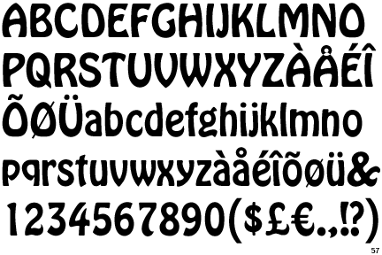
I’ve never been a fan of Hobo though:
what was that thread where some ilx ppl discussed some article by some wite person in possibly the new york times who said america in the 2010s ‘made some good fonts’ or something
or 2k0s
HAHA COMIC SANS AMIRITE is p much Community fan internet 101, and at this point worse than OMG BACON OM NOM NOM
yeah
Cooper Chucklebutt otm tho
whiney could u do a venn diagram of community fans, wite ppl and tumblr whites
i guess it would be like someone with mild myopia looking at a dinnerplate
poll: is whiney a tumblr white
Ha, Papyrus; used on every tapas bar menu iirc
Whiney, does being infatuated with a rhetorical style virtually indistinguishable from Colin Quinn ever get embarrassing for you?
papyrus is inescapable on restaurant signage
jokerman is pretty bad
I went to Wikipedia to find an example of Jokerman and was completely sidetracked by the discovery of a font named JIM CROW

I mean, seriously WHAT THE HELL
HAHA COMIC SANS AMIRITE is p much Community fan internet 101, and at this point worse than OMG BACON OM NOM NOM
just, bravo, I mean I have to bow down to the ability to shoehorn your pet hates into like every possible subject
I apologize to everyone on this board at whom I may have yelled in the past, because I am about 500% certain that none of you would have the gall to name a font fucking Jim Crow
Yeah, o_O at that one.
dangit, just came here to say Papyrus
i used to use that occasionally on ILX CHATZ to agitate
lol @ Jokerman btw:
My most-hated font is probably Algerian. Lots of businesses use it because it’s the most ~interesting~ font that comes standard in MS Word. But that also means it’s immediately recognizable as a font that comes standard in MS Word.
Like I have basically decided to boycott this bar:

lol

Speaking of a font businesses always seem to use, this is a big offender, and almost always looks rubbish:
http://upload.wikimedia.org/wikipedia/commons/2/28/MS_Copperplate_Sample.PNG
gah!

lol the gotham font



possibly the only thing more obnoxious than trajan is that guy’s attitude xp
Papyrus is like the ultimate middlebrow analogue to Comic Sans’s lowbrow.
Maybe “middlebrow” is too generous. But you know, aspirational.
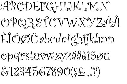
curlzzzzzzzzzzz
\(^o^)/
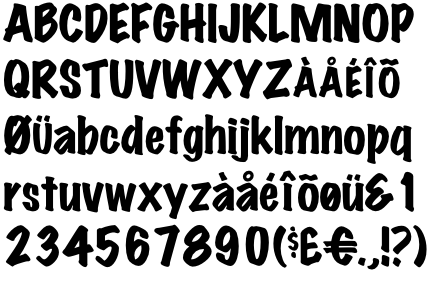
I actually kinda like Marker Felt. It’s pretty readable if there isn’t too much of it.
I saw it used in a company’s sign on their building a few years ago and thought, This is going to be the next Comic Sans, isn’t it?
marker felt looks good as hell right up there t-b-h
is papyrus the britta of fonts or is complaining about papyrus the britta of typing things into thei nternet
the answer is always the one with the internet in it
i like comic sans, its jaunty
actually i mostly just dont notice ‘fonts’
one time i installed some graffiti fonts on my computer and internet explorer got all graffed out lol, rip os9
I never thought about how many annoying fonts there were until now — Kristen seems particularly irritating for some reason.
yeah a couple of these made me wince
Is there such a thing as a good calligraphy/handwriting font? Like for recreating a fancy document for framing?
I am font-stupid to the maxxx and I have kind of tacky taste and I need someone with discerning taste to point me in the right direction for a project.
I saw it used in a company’s sign on their building a few years ago and thought, This is going to be the next Comic Sans, isn’t it?
RIP Marker Felt
Is there such a thing as a good calligraphy/handwriting font?
typophiles would say Zapfino but i’ve always found it a bit ugly
it’s no Gothic
Speaking of a font businesses always seem to use, this is a big offender, and almost always looks rubbish:
http://upload.wikimedia.org/wikipedia/commons/2/28/MS_Copperplate_Sample.PNG
― Chewshabadoo, Friday, December 16, 2011 6:45 PM (4 days ago) Bookmark Permalink
I totally guessed this before even seeing it.
Was actually complaining about it earlier today.

I’ve seen some pretty bad examples lately, but I feel like the fucking ACT UP website should maybe have a little more typographic dignity...
Ok, in all fairness it’s only a few instances, and nowhere near the main page (which is itself marked by an angelfire level html primitivism (that’s kind of endearing actually)) but still.
Is there such a thing as a good calligraphy/handwriting font?
Suomi Hand is an amazing casual handwriting font—especially if you use an application with open type support for automatic glyph switching.
problem is handwriting doesnt look like a font, its irregular w/variations in how letters are written depending on where they come in a word which letter they abut and randomness, so when you have a uniform system trying to imitate that it just ends up looking cloying and fake
that one is p good tho! lol
handwriting fonts just rely on endless amounts of ligatures but its like isn’t that a lot of work why not just write things
well if you have to create the font yrself its prob not worth it
Comic Sans is partially responsible for creation of Jerkcity, this fact makes up for every sin that has been committed using this font
The embedded youtube link above is the first time I’ve clicked/heard/seen the clip for Blink 182’s ‘I Miss You’.
Zapfino is an illegible tech demo.
handwriting fonts just rely on endless amounts of ligatures but its like isn’t that a lot of work why not just write things
Opentype allows for software to automatically switch ligatures depending on context or random choice.