Thanks, at least I know what it is now!
There’s another option to put the new threads table below recently updated threads, if that helps at all.
Just an observation on the main view for each board (or SNA/recent activity). I can only see the 6 or 7 recently updated threads, even on “minimal view”. On the right I can see 5 or 6 new threads (some of which are the same as the recently updated threads on the left).
That’s a total of about 10 visible threads.
On current ilx I can see about 25 most recent threads, (bookmarks + SNA), at least on the old.css stylesheet with previews disabled. I like being able to scan that many at a time.
No idea how many feel the same way, of course
Thanks
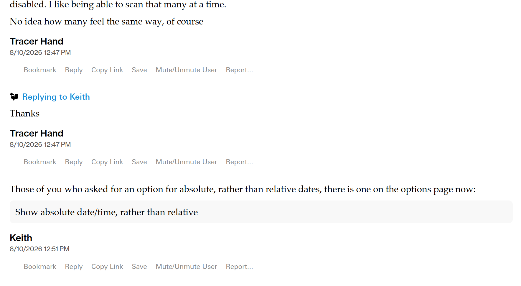
Those of you who asked for an option for absolute, rather than relative dates, there is one on the options page now:
Show absolute date/time, rather than relative
sadbonx, I put in an option to always show post menu. See if that helps.
This is great, thank you! It would be lovely if it could take up less vertical space, but one step at a time.
Okay, see if that’s better. There also shouldn’t be that weird gap to the left of “Bookmark”, but having just looked, it’s because this option is conflicting with the show username etc. below the post. Give me some time and I’m sure I can sort that too.
Thank you sir. Can any of the three lines—name, date, menu—be combined, so it doesn’t take up three lines? Or is that a request that goes deeper than cosmetics, probably?
Absolute date/time is a very welcome option. I would suggest making it the default with “relative” as the opt-in, which I think you implemented on ILX maybe eight or nine years ago (?), and has served pretty well! Of course, I’m biased as one of the cluster of people who just dislike relative dating in general: https://www.ilxor.com/ILX/ThreadSelectedControllerServlet?showall=true&bookmarkedmessageid=8322222&boardid=40&threadid=109285. But from people’s C&Ps of other posts, you can tell that both modes are widely used.
Although interestingly I guess it’s displaying the posting user’s local time, which means posts in sequence can seem to jump forwards and backwards in time, with people in different time zones. Has it always done that and I just never noticed?
Btw I know you have a long long list of to-do items, but I’m realizing how much I rely on the xpost warning to adjust my posts as the conversation continued above me! (TESTING: Editing post for a typo)
Ha, right enough. I can’t remember what it did before, it was more like 20 years ago than 9. However, thinking about this, it’s going to want to convert datetimes to the locale of the user, rather than the originator.
Sorry, I’m doing this stuff too quickly, so I expect there will be bugs that creep in. Will take a look later.
No sorry to be sorry for! Just noting stuff as I see it. Thanks for taking seriously all my deranged post-it notes.
Haha, no bother.
still hard for this almost-60 guy with reading glasses to see where the posts delineate, but maybe I just need to play around with formatting more
great post Lily Dale TYVM
Right, I figured it out, but it’ll take some time. If you refresh the page, you’ll see all the dates and times in your timezone; however, as they arrive live, at the moment, they’re coming in the poster’s timezone... This is because of how broadcasting messages works:
A user posts
That message is broadcast to all listening users
But if it is to be correct, then the message much be altered on a per recipient basis, so if I’m sending it to someone in Spain, they have to have the date altered to Spain time, someone in Australia, likewise etc.
So that’s just a bit more complicated, and will take a bit more time.
Sleeve, if you play with “Post separator” in text display options, there are options for more space, various types of lines, traditional typographic thing, and some stupid stuff.
The post separator options go a long way. Sleeve, I’d also try the option to put the username below the post, which I find very effective.
Thank you sir. Can any of the three lines—name, date, menu—be combined, so it doesn’t take up three lines? Or is that a request that goes deeper than cosmetics, probably?
Sadbonx, it does for the whole lot, but it is quite straightforward to change the time to be t0 the right of the username; the menu less so. That said, I’d be changing an option people seem broadly happy with, and I am kind of nervous of having so many options that it becomes rapidly unwieldy. Perhaps people can give their view and I can do it if people want it, or don’t care one way or another.
cool thx y’all xps
lol will we be able to disable reacts to our posts as well? ;)
Haha, well you know, I did just find that handy! But I mean I have pushed to let people see this, so they have a chance, but the rate of signup here has (obviously) slowed and views haven’t changed, so I wouldn’t worry about that.
Sorry, I’m probably being overly circumspect there, what I mean is I’ll give it until tomorrow evening or something (a week), and assuming there’s no massive groundswell of opinion in the next 36 hours, then I’ll look to put something in that lets admins disable reactions on specific boards, and obviously then they can just do that.
And I don’t mean disable viewing them, I mean removing the ability for people to post and/or receive them.
so many options that it becomes rapidly unwieldy
Perhaps some of these details could be left up to aftermarket CSS styles rather than dozens of options tickboxes? I know you said it’s more complicated by far than the cuurent site, but on one of these threads Treefell was saying it looked at least possible.
It’s certainly possible, so I wasn’t saying people couldn’t do it, just that now at almost 12,000 lines of code vs. about 300, it’s harder. That doesn’t make much difference to me, though, if people want to have a go, although in practical terms no-one’s going to write 12,000 lines of CSS, plus they would break all the functions they can’t see, like admin functions etc. However, I think what’s practical is that when I get to that point, an override stylesheet can be provided which takes the 12K one as the starting point, but is loaded after it, so overrides bits of it. I’d need a new mechanism for including it, although that’s fine, and I do think it has some complexities, e.g. the current mechanism is a one-and-done setup—you choose one stylesheet, that’s what you get. You’re kind of hinting at a mix-and-match setup (maybe you’re not, I dunno), where you can pick a selection of individual things that change specific things. And if you do that, then you have an ordering issue too, because CSS is order-sensitive, so you might need to be able to control the order of inclusion—probably getting too complex for the average punter.
Anyway, some version of that is doable—I guess what I’m saying is that it requires thought—right now, I’d suggest you just ask a bunch of people if in “show metadata below post” mode, it’s okay to put the username and datetime horizontally, just because it’s going to be much faster.
What I did here was copy the text from your post, edit it down, and then format it as a quote, like in old-ILX. It’s not as fancy as the automatic quoting but it works.
This is good, thanks. One thing I noticed is you cannot copy post text and the poster’s username at the same time. When I quote someone on ILX, at least if I am quoting an entire post, I mostly like to copy their username/post time, etc. so that I and others can see exactly who posted it and when.
I guess I find the username/time as part of the quote makes it more authoritative, like a citation almost.
Yes, I noticed that too and would like to be able to.
Date to the right of username seems like it’d be fine, it’s what we have on current ILX after all. There might need to be some finessing with the fonts or spacing or something, but we’d be able to iterate on that it after seeing it on the screen.
Okay, so at the risk of a bunch of people having a go at me, but in the interests of expediency, I’ve done it—if some people don’t like it, then well we can cross that bridge at that point; this is after all, a test site, and it’s what it’s for. See what you think.
Also, I think I have fixed the issue with the date time being transmitted in the poster’s form, rather than the recipients, although it was kind of tricky, so fingers crossed all is well.
I like it!